
Multi-step forms are a good choice when your form is large and has many controls. No one wants to scroll through a super-long form on a mobile device. By grouping controls on a screen-by-screen basis, we can improve the experience of filling out long, complex forms.
But when was the last time you developed a multi-step form? Does that even sound fun to you? There’s so much to think about and so many moving pieces that need to be managed that I wouldn’t blame you for resorting to a form library or even some type of form widget that handles it all for you.
But doing it by hand can be a good exercise and a great way to polish the basics. I’ll show you how I built my first multi-step form, and I hope you’ll not only see how approachable it can be but maybe even spot areas to make my work even better.
We’ll walk through the structure together. We’ll build a job application, which I think many of us can relate to these recent days. I’ll scaffold the baseline HTML, CSS, and JavaScript first, and then we’ll look at considerations for accessibility and validation.
I’ve created a GitHub repo for the final code if you want to refer to it along the way.
The structure of a multi-step form
Our job application form has four sections, the last of which is a summary view, where we show the user all their answers before they submit them. To achieve this, we divide the HTML into four sections, each identified with an ID, and add navigation at the bottom of the page. I’ll give you that baseline HTML in the next section.
Navigating the user to move through sections means we’ll also include a visual indicator for what step they are at and how many steps are left. This indicator can be a simple dynamic text that updates according to the active step or a fancier progress bar type of indicator. We’ll do the former to keep things simple and focused on the multi-step nature of the form.,
The structure and basic styles
We’ll focus more on the logic, but I will provide the code snippets and a link to the complete code at the end.
Let’s start by creating a folder to hold our pages. Then, create an index.html file and paste the following into it:
Open HTML
<form id="myForm">
<section class="group-one" id="one">
<div class="form-group">
<div class="form-control">
<label for="name">Name <span style="color: red;">*</span></label>
<input type="text" id="name" name="name" placeholder="Enter your name">
</div>
<div class="form-control">
<label for="idNum">ID number <span style="color: red;">*</span></label>
<input type="number" id="idNum" name="idNum" placeholder="Enter your ID number">
</div>
</div>
<div class="form-group">
<div class="form-control">
<label for="email">Email <span style="color: red;">*</span></label>
<input type="email" id="email" name="email" placeholder="Enter your email">
</div>
<div class="form-control">
<label for="birthdate">Date of Birth <span style="color: red;">*</span></label>
<input type="date" id="birthdate" name="birthdate" max="2006-10-01" min="1924-01-01">
</div>
</div>
</section>
<section class="group-two" id="two">
<div class="form-control">
<label for="document">Upload CV <span style="color: red;">*</span></label>
<input type="file" name="document" id="document">
</div>
<div class="form-control">
<label for="department">Department <span style="color: red;">*</span></label>
<select id="department" name="department">
<option value="">Select a department</option>
<option value="hr">Human Resources</option>
<option value="it">Information Technology</option>
<option value="finance">Finance</option>
</select>
</div>
</section>
<section class="group-three" id="three">
<div class="form-control">
<label for="skills">Skills (Optional)</label>
<textarea id="skills" name="skills" rows="4" placeholder="Enter your skills"></textarea>
</div>
<div class="form-control">
<input type="checkbox" name="terms" id="terms">
<label for="terms">I agree to the terms and conditions <span style="color: red;">*</span></label>
</div>
<button id="btn" type="submit">Confirm and Submit</button>
</section>
<div class="arrows">
<button type="button" id="navLeft">Previous</button>
<span id="stepInfo"></span>
<button type="button" id="navRight">Next</button>
</div>
</form>
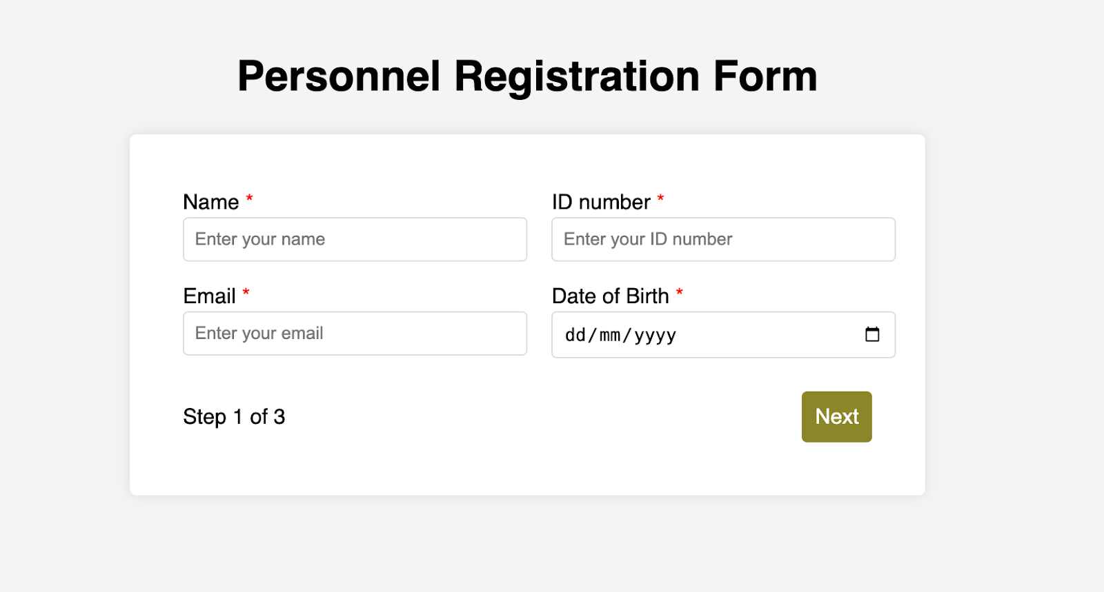
<script src="script.js"></script>Looking at the code, you can see three sections and the navigation group. The sections contain form inputs and no native form validation. This is to give us better control of displaying the error messages because native form validation is only triggered when you click the submit button.
Next, create a styles.css file and paste this into it:
Open base styles
:root {
  --primary-color: #8c852a;
  --secondary-color: #858034;
}

body {
  font-family: sans-serif;
  line-height: 1.4;
  margin: 0 auto;
  padding: 20px;
  background-color: #f4f4f4;
  max-width: 600px;
}

h1 {
  text-align: center;
}

form {
  background: #fff;
  padding: 40px;
  border-radius: 5px;
  box-shadow: 0 0 10px rgba(0, 0, 0, 0.1);
  display: flex;
  flex-direction: column;
}

.form-group {
  display: flex;
  gap: 7%;

}

.form-group > div {
  width: 100%;
}

input:not([type="checkbox"]),
select,
textarea {
  width: 100%;
  padding: 8px;
  border: 1px solid #ddd;
  border-radius: 4px;
}

.form-control {
  margin-bottom: 15px;
}

button {
  display: block;
  width: 100%;
  padding: 10px;
  color: white;
  background-color: var(--primary-color);
  border: none;
  border-radius: 4px;
  cursor: pointer;
  font-size: 16px;

}

button:hover {
  background-color: var(--secondary-color);
}

.group-two, .group-three {
  display: none;
}

.arrows {
  display: flex;
  justify-content: space-between
  align-items: center;
  margin-top: 10px;
}

#navLeft, #navRight {
  width: fit-content;
}

@media screen and (max-width: 600px) {
  .form-group {
    flex-direction: column;
  }
}
Open up the HTML file in the browser, and you should get something like the two-column layout in the following screenshot, complete with the current page indicator and navigation.
Adding functionality with vanilla JavaScript
Now, create a script.js file in the same directory as the HTML and CSS files and paste the following JavaScript into it:
Open base scripts
const stepInfo = document.getElementById("stepInfo");
const navLeft = document.getElementById("navLeft");
const navRight = document.getElementById("navRight");
const form = document.getElementById("myForm");
const formSteps = ["one", "two", "three"];

let currentStep = 0;

function updateStepVisibility() {
  formSteps.forEach((step) => {
    document.getElementById(step).style.display = "none";
  });

  document.getElementById(formSteps[currentStep]).style.display = "block";
  stepInfo.textContent = `Step ${currentStep + 1} of ${formSteps.length}`;
  navLeft.style.display = currentStep === 0 ? "none" : "block";
  navRight.style.display =
  currentStep === formSteps.length - 1 ? "none" : "block";
}

document.addEventListener("DOMContentLoaded", () => {
  navLeft.style.display = "none";
  updateStepVisibility();
  navRight.addEventListener("click", () => {
    if (currentStep < formSteps.length - 1) {
      currentStep++;
      updateStepVisibility();
    }
  });

  navLeft.addEventListener("click", () => {
    if (currentStep > 0) {
      currentStep--;
      updateStepVisibility();
    }
  });
});
This script defines a method that shows and hides the section depending on the formStep values that correspond to the IDs of the form sections. It updates stepInfo with the current active section of the form. This dynamic text acts as a progress indicator to the user.
It then adds logic that waits for the page to load and click events to the navigation buttons to enable cycling through the different form sections. If you refresh your page, you will see that the multi-step form works as expected.
Multi-step form navigation
Let’s dive deeper into what the Javascript code above is doing. In the updateStepVisibility() function, we first hide all the sections to have a clean slate:
formSteps.forEach((step) => {
  document.getElementById(step).style.display = "none";
});
Then, we show the currently active section:
document.getElementById(formSteps[currentStep]).style.display = "block";`Next, we update the text that indicators progress through the form:
stepInfo.textContent = `Step ${currentStep + 1} of ${formSteps.length}`;Finally, we hide the Previous button if we are at the first step and hide the Next button if we are at the last section:
navLeft.style.display = currentStep === 0 ? "none" : "block";
navRight.style.display = currentStep === formSteps.length - 1 ? "none" : "block";
Let’s look at what happens when the page loads. We first hide the Previous button as the form loads on the first section:
document.addEventListener("DOMContentLoaded", () => {
navLeft.style.display = "none";
updateStepVisibility();
Then we grab the Next button and add a click event that conditionally increments the current step count and then calls the updateStepVisibility() function, which then updates the new section to be displayed:
navRight.addEventListener("click", () => {
  if (currentStep < formSteps.length - 1) {
    currentStep++;
    updateStepVisibility();
  }
});
Finally, we grab the Previous button and do the same thing but in reverse. Here, we are conditionally decrementing the step count and calling the updateStepVisibility():
navLeft.addEventListener("click", () => {
  if (currentStep > 0) {
    currentStep--;
    updateStepVisibility();
  }
});
Handling errors
Have you ever spent a good 10+ minutes filling out a form only to submit it and get vague errors telling you to correct this and that? I prefer it when a form tells me right away that something’s amiss so that I can correct it before I ever get to the Submit button. That’s what we’ll do in our form.
Our principle is to clearly indicate which controls have errors and give meaningful error messages. Clear errors as the user takes necessary actions. Let’s add some validation to our form. First, let’s grab the necessary input elements and add this to the existing ones:
const nameInput = document.getElementById("name");
const idNumInput = document.getElementById("idNum");
const emailInput = document.getElementById("email");
const birthdateInput = document.getElementById("birthdate")
const documentInput = document.getElementById("document");
const departmentInput = document.getElementById("department");
const termsCheckbox = document.getElementById("terms");
const skillsInput = document.getElementById("skills");
Then, add a function to validate the steps:
Open validation script
function validateStep(step) {
  let isValid = true;

  if (step === 0) {
    if (nameInput.value.trim() === "")
    showError(nameInput, "Name is required");
    isValid = false;
  }

  if (idNumInput.value.trim() === "") {
    showError(idNumInput, "ID number is required");
    isValid = false;
  }

  if (emailInput.value.trim() === "" || !emailInput.validity.valid) {
    showError(emailInput, "A valid email is required");
    isValid = false;
  }

  if (birthdateInput.value === "") {
    showError(birthdateInput, "Date of birth is required");
    isValid = false;
  }

  else if (step === 1) {

    if (!documentInput.files[0]) {
      showError(documentInput, "CV is required");
      isValid = false;
    }

    if (departmentInput.value === "") {
      showError(departmentInput, "Department selection is required");
      isValid = false;
    }
  } else if (step === 2) {

    if (!termsCheckbox.checked) {
      showError(termsCheckbox, "You must accept the terms and conditions");
      isValid = false;
    }
  }

  return isValid;
}
Here, we check if each required input has some value and if the email input has a valid input. Then, we set the isValid boolean accordingly. We also call a showError() function, which we haven’t defined yet.
Paste this code above the validateStep() function:
function showError(input, message) {
  const formControl = input.parentElement;
  const errorSpan = formControl.querySelector(".error-message");
  input.classList.add("error");
  errorSpan.textContent = message;
}
Now, add the following styles to the stylesheet:
Open validation styles
input:focus, select:focus, textarea:focus {
outline: .5px solid var(--primary-color);
}
input.error, select.error, textarea.error {
outline: .5px solid red;
}
.error-message {
font-size: x-small;
color: red;
display: block;
margin-top: 2px;
}
.arrows {
color: var(--primary-color);
font-size: 18px;
font-weight: 900;
}
#navLeft, #navRight {
display: flex;
align-items: center;
gap: 10px;
}
#stepInfo {
color: var(--primary-color);
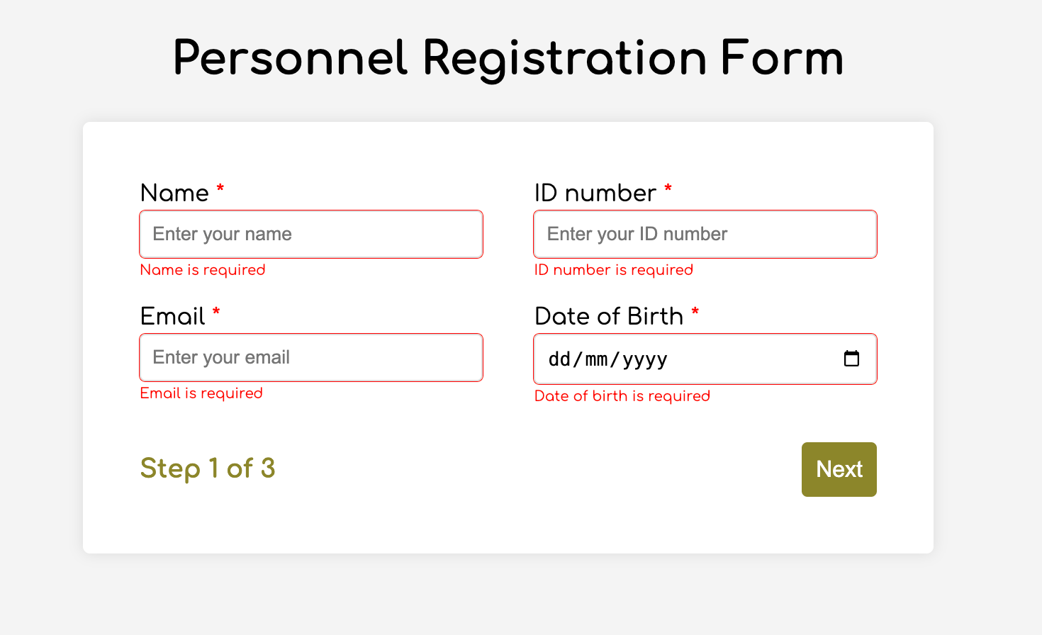
}If you refresh the form, you will see that the buttons do not take you to the next section till the inputs are considered valid:
Finally, we want to add real-time error handling so that the errors go away when the user starts inputting the correct information. Add this function below the validateStep() function:
Open real-time validation script
function setupRealtimeValidation() {
  nameInput.addEventListener("input", () => {
    if (nameInput.value.trim() !== "") clearError(nameInput);
  });

  idNumInput.addEventListener("input", () => {
    if (idNumInput.value.trim() !== "") clearError(idNumInput);
  });

  emailInput.addEventListener("input", () => {
    if (emailInput.validity.valid) clearError(emailInput);
  });

  birthdateInput.addEventListener("change", () => {
    if (birthdateInput.value !== "") clearError(birthdateInput);
  });

  documentInput.addEventListener("change", () => {
    if (documentInput.files[0]) clearError(documentInput);
  });

  departmentInput.addEventListener("change", () => {
    if (departmentInput.value !== "") clearError(departmentInput);
  });

  termsCheckbox.addEventListener("change", () => {
    if (termsCheckbox.checked) clearError(termsCheckbox);
  });
}
This function clears the errors if the input is no longer invalid by listening to input and change events then calling a function to clear the errors. Paste the clearError() function below the showError() one:
function clearError(input) {
  const formControl = input.parentElement;
  const errorSpan = formControl.querySelector(".error-message");
  input.classList.remove("error");
  errorSpan.textContent = "";
}
And now the errors clear when the user types in the correct value:

The multi-step form now handles errors gracefully. If you do decide to keep the errors till the end of the form, then at the very least, jump the user back to the erroring form control and show some indication of how many errors they need to fix.
Handling form submission
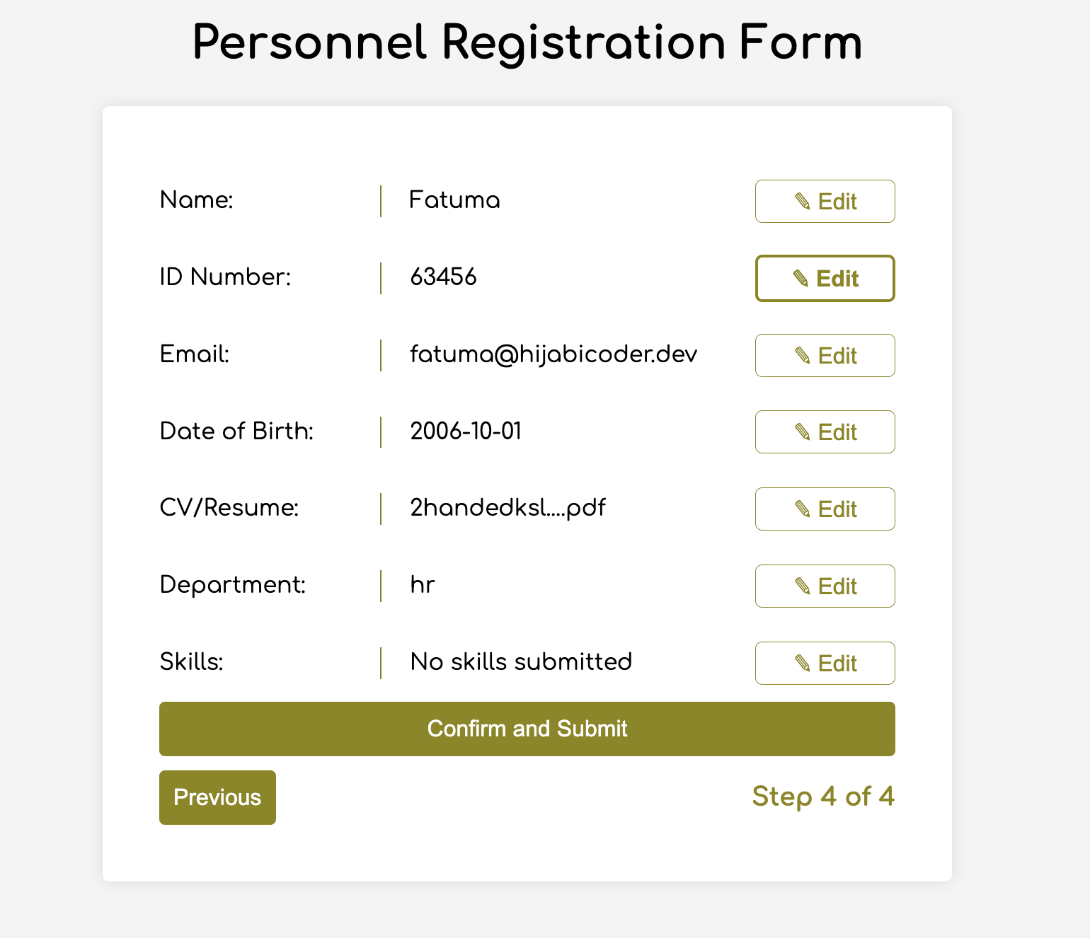
In a multi-step form, it is valuable to show the user a summary of all their answers at the end before they submit and to offer them an option to edit their answers if necessary. The person can’t see the previous steps without navigating backward, so showing a summary at the last step gives assurance and a chance to correct any mistakes.
Let’s add a fourth section to the markup to hold this summary view and move the submit button within it. Paste this just below the third section in index.html:
Open HTML
<section class="group-four" id="four">
  <div class="summary-section">
    <p>Name: </p>
    <p id="name-val"></p>
    <button type="button" class="edit-btn" id="name-edit">
    <span>✎</span>
    <span>Edit</span>
    </button>
  </div>

  <div class="summary-section">
    <p>ID Number: </p>
    <p id="id-val"></p>
    <button type="button" class="edit-btn" id="id-edit">
    <span>✎</span>
    <span>Edit</span>
    </button>
  </div>

  <div class="summary-section">
    <p>Email: </p>
    <p id="email-val"></p>
    <button type="button" class="edit-btn" id="email-edit">
    <span>✎</span>
    <span>Edit</span>
    </button>
  </div>

  <div class="summary-section">
    <p>Date of Birth: </p>
    <p id="bd-val"></p>
    <button type="button" class="edit-btn" id="bd-edit">
    <span>✎</span>
    <span>Edit</span>
    </button>
  </div>

  <div class="summary-section">
    <p>CV/Resume: </p>
    <p id="cv-val"></p>
    <button type="button" class="edit-btn" id="cv-edit">
      <span>✎</span>
      <span>Edit</span>
    </button>
  </div>

  <div class="summary-section">
    <p>Department: </p>
    <p id="dept-val"></p>
    <button type="button" class="edit-btn" id="dept-edit">
      <span>✎</span>
      <span>Edit</span>
    </button>
  </div>

  <div class="summary-section">
    <p>Skills: </p>
    <p id="skills-val"></p>
    <button type="button" class="edit-btn" id="skills-edit">
      <span>✎</span>
      <span>Edit</span>
    </button>
  </div>

  <button id="btn" type="submit">Confirm and Submit</button>
</section>
Then update the formStep in your Javascript to read:
const formSteps = ["one", "two", "three", "four"];Finally, add the following classes to styles.css:
.summary-section {
  display: flex;
  align-items: center;
  gap: 10px;
}

.summary-section p:first-child {
  width: 30%;
  flex-shrink: 0;
  border-right: 1px solid var(--secondary-color);
}

.summary-section p:nth-child(2) {
  width: 45%;
  flex-shrink: 0;
  padding-left: 10px;
}

.edit-btn {
  width: 25%;
  margin-left: auto;
  background-color: transparent;
  color: var(--primary-color);
  border: .7px solid var(--primary-color);
  border-radius: 5px;
  padding: 5px;
}

.edit-btn:hover {
  border: 2px solid var(--primary-color);
  font-weight: bolder;
  background-color: transparent;
}
Now, add the following to the top of the script.js file where the other consts are:
const nameVal = document.getElementById("name-val");
const idVal = document.getElementById("id-val");
const emailVal = document.getElementById("email-val");
const bdVal = document.getElementById("bd-val")
const cvVal = document.getElementById("cv-val");
const deptVal = document.getElementById("dept-val");
const skillsVal = document.getElementById("skills-val");
const editButtons =
  "name-edit": 0,
  "id-edit": 0,
  "email-edit": 0,
  "bd-edit": 0,
  "cv-edit": 1,
  "dept-edit": 1,
  "skills-edit": 2
};
Then add this function in scripts.js:
function updateSummaryValues() {
  nameVal.textContent = nameInput.value;
  idVal.textContent = idNumInput.value;
  emailVal.textContent = emailInput.value;
  bdVal.textContent = birthdateInput.value;

  const fileName = documentInput.files[0]?.name;
  if (fileName)
  const extension = fileName.split(".").pop();
  const baseName = fileName.split(".")[0];
  const truncatedName = baseName.length > 10 ? baseName.substring(0, 10) + "..." : baseName;
  cvVal.textContent = `${truncatedName}.${extension}`;
  } else {
    cvVal.textContent = "No file selected";
  }

  deptVal.textContent = departmentInput.value;
  skillsVal.textContent = skillsInput.value || "No skills submitted";
}
This dynamically inserts the input values into the summary section of the form, truncates the file names, and offers a fallback text for the input that was not required.
Then update the updateStepVisibility() function to call the new function:
function updateStepVisibility() {
  formSteps.forEach((step) => {
    document.getElementById(step).style.display = "none";
  });

  document.getElementById(formSteps[currentStep]).style.display = "block";
  stepInfo.textContent = `Step ${currentStep + 1} of ${formSteps.length}`;
  if (currentStep === 3) {
    updateSummaryValues();
  }

  navLeft.style.display = currentStep === 0 ? "none" : "block";
  navRight.style.display = currentStep === formSteps.length - 1 ? "none" : "block";
}
Finally, add this to the DOMContentLoaded event listener:
Object.keys(editButtons).forEach((buttonId) => {
  const button = document.getElementById(buttonId);
  button.addEventListener("click", (e) => {
    currentStep = editButtons[buttonId];
    updateStepVisibility();
  });
});
Running the form, you should see that the summary section shows all the inputted values and allows the user to edit any before submitting the information:
And now, we can submit our form:
form.addEventListener("submit", (e) => {
  e.preventDefault();

  if (validateStep(2)) {
    alert("Form submitted successfully!");
    form.reset();
    currentFormStep = 0;
    updateStepVisibility();
}
});
Our multi-step form now allows the user to edit and see all the information they provide before submitting it.
Accessibility tips
Making multi-step forms accessible starts with the basics: using semantic HTML. This is half the battle. It is closely followed by using appropriate form labels.
Other ways to make forms more accessible include giving enough room to elements that must be clicked on small screens and giving meaningful descriptions to the form navigation and progress indicators.
Offering feedback to the user is an important part of it; it’s not great to auto-dismiss user feedback after a certain amount of time but to allow the user to dismiss it themselves. Paying attention to contrast and font choice is important, too, as they both affect how readable your form is.
Let’s make the following adjustments to the markup for more technical accessibility:
- Add
aria-required="true"to all inputs except the skills one. This lets screen readers know the fields are required without relying on native validation. - Add
role="alert"to the error spans. This helps screen readers know to give it importance when the input is in an error state. - Add
role="status" aria-live="polite"to the.stepInfo. This will help screen readers understand that the step info keeps tabs on a state, and the aria-live being set to polite indicates that should the value change, it does not need to immediately announce it.
In the script file, replace the showError() and clearError() functions with the following:
function showError(input, message) {
  const formControl = input.parentElement;
  const errorSpan = formControl.querySelector(".error-message");
  input.classList.add("error");
  input.setAttribute("aria-invalid", "true");
  input.setAttribute("aria-describedby", errorSpan.id);
  errorSpan.textContent = message;
  }

  function clearError(input) {
  const formControl = input.parentElement;
  const errorSpan = formControl.querySelector(".error-message");
  input.classList.remove("error");
  input.removeAttribute("aria-invalid");
  input.removeAttribute("aria-describedby");
  errorSpan.textContent = "";
}
Here, we programmatically add and remove attributes that explicitly tie the input with its error span and show that it is in an invalid state.
Finally, let’s add focus on the first input of every section; add the following code to the end of the updateStepVisibility() function:
const currentStepElement = document.getElementById(formSteps[currentStep]);
const firstInput = currentStepElement.querySelector(
  "input, select, textarea"
);

if (firstInput) {
  firstInput.focus();
}
And with that, the multi-step form is much more accessible.
Conclusion
There we go, a four-part multi-step form for a job application! As I said at the top of this article, there’s a lot to juggle — so much so that I wouldn’t fault you for looking for an out-of-the-box solution.
But if you have to hand-roll a multi-step form, hopefully now you see it’s not a death sentence. There’s a happy path that gets you there, complete with navigation and validation, without turning away from good, accessible practices.
And this is just how I approached it! Again, I took this on as a personal challenge to see how far I could get, and I’m pretty happy with it. But I’d love to know if you see additional opportunities to make this even more mindful of the user experience and considerate of accessibility.
References
Here are some relevant links I referred to when writing this article:
- How to Structure a Web Form (MDN)
- Multi-page Forms (W3C.org)
- Create accessible forms (A11y Project)
This seems like an awesome article. I love the way you simplified CSS plus the pictorial codes.
Big fan of the use of flex to reflow the form as the viewport changes. Also a big fan of using native HTML form controls.
Some notes on the accessibility tips in the post.
Use
requiredoveraria-required. To avoid native form validation, addnovalidateto the<form>element. There is no need for ARIA here.Do not add
alertroles to the error messages. Thearia-describedbyalready behaves that way with Chrome. I have year-old testing data on a few methods for exposing field errors that might be useful. Instead, since you do validation on submit, consider a box to hold all the error messages (I have an example you can see in action along with explanations).I think a structural change might be better than relying on a live region to announce the step. Wrapping each step in a
<fieldset>and<legend>with the current step number can do the work. Since you set focus to a field after submitting, the value of the<legend>would be announced with the field and you can avoid a live region. Users can also easily get that<legend>value in the context of using the form.Now for some general accessibility feedback:
The red (#ff0000) asterisk and error text have insufficient contrast against (4:1) the white background. Using #ee0000 will get you 4.5:1, passing WCAG SC 1.4.3: Contrast (Minimum).
The “Next” and “Previous” buttons also have a contrast issue, at 3.8:1, and since the text is only 16px and not bold it doesn’t qualify as large scale text (where it would only need a 3:1 ratio.
The placeholder text in the fields passes contrast checks, but plenty of testing suggests users will think those are values. While there is no shortage of articles, WebAIM’s post guides you to avoid failing SC 1.3.5: Identify Input Purpose by adding
autocompleteto your fields.Since you are asking for a birthday, which most people know readily, I encourage you to replace the date field with a standard text input. This avoids known accessibility issues with native date pickers (old post, but still accurate).
Also, since you have identified a single optional field (in an ideal way, too), I suggest an instruction above the entire form that states all fields are required. Then you can drop the asterisks and keep the optional note on the “Skills” field.
I recommend being cautious about autofocusing the first field of the form on load. That can be annoying for screen reader users who then have to switch modes and navigate out of the field to get more context on the surrounding page. As part of a known flow, this may be totally fine (or preferred).
I assure you I used Markdown to make a numbered list and then an unordered list in that comment. Just pretend each
<br>is the end of a list item.It’s such a pain, and I’m sorry Adrian!
Next article idea: now do it without js! For example: https://codepen.io/Prestaul/pen/jENBgqv?editors=1100
Good evening. I love your creativity towards your works and projects, just like the form you created above.
It shows that you’re such an industrious and serious person, who is interested in the well being of others.
Thanks for this wonderful and creative project of yours, you’re really amazing.
I will like to ask you some questions and they are as follows.
1) Please, did you use things like bootstrap, APIs, etc. please if you did I wil like you to explain how you applied it in this wonderful form of yours.
2) I want to know why you used “value” as an attribute in “option” tags.
3) What is the meaning of “cross origin” and why did you use it in the “link” tags.
4) What is the meaning and the function of your first styling in your style.css file ie “:root{ …”
5) Explain the meaning and function of “flex-direction: column”
6) What is the meaning and function of ” input:focus, select:focus, textarea:focus {
outline: .5px solid var(–primary-color);
}
input.error, select.error, textarea.error{
outline: .5px solid red;
} ” in your style.css file.
7) What is the meaning of “color: var(–primary-color)” in your style.css file.
Thanks as I await your favourable responses to my questions above.
Please I will like you to connect me to different coding and web-development groups and websites from where I can learn more and be well equipped, this is because I am still a learner.
Thanks.
Thank you for this article. My question is how can you use firebase and firestore to handle the database submission of an HTML form such as this. Thank you.
Great tutorial on creating multi-step forms with vanilla JavaScript and CSS. This approach keeps things lightweight and efficient while improving user experience.