
“Off Canvas” patterns are different ways to approach layout where content on the web isn’t just laid out in a vertical column. For instance, navigation could be positioned hidden off the left edge of the “canvas” (visible browser window) and slid in on demand. Anthony Colangelo created jPanelMenu to do just that. Hakim El Hattab’s Meny is fancier but similar in what it accomplishes.
They both use JavaScript. I thought it would be fun to try and recreate Anthony’s jPanelMenu using only CSS. It’s do-able – with several advantages and disadvantages.
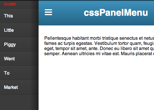
View Demo
Two Columns, One Collapsed
The layout technique here is essentially a two column grid. Only the left column is 0% wide and the right column is 100% wide by default. The left column is the navigation we intend to reveal as needed. With hidden overflow, this column is completely hidden.
<!-- I am collapsed by default -->
<nav id="main-navigation" class="navigation">
   <a href="#">Nav Links</a>
   <!-- more -->
</nav>

<!-- I am full width by default -->
<div class="page-wrap">
  <header>
    <a href="#main-navigation">Menu</a>
    <h1>Title</h1>
  </header>

  <!-- content -->
</div>
.navigation {
/* Collapsed */
width: 0;
overflow: hidden;
position: fixed;
top: 0;
left: 0;
height: 100%;
}
.page-wrap {
width: 100%;
float: right;
}Open Menu State with :target
Notice that this link:
<a href="#main-navigation">Menu</a>Matches the ID of:
<nav id="main-navigation" class="navigation">That’s a regular ol’ hash-link. The page will “jump” to that element. More importantly to us, it will make this selector match:
#main-navigation:target {

}
So when that link is clicked, we can un-hide the menu by increasing it’s width. Might as well make it slide out nicely.
.navigation {
  transition: width 0.3s ease;
}
#main-nav:target {
  width: 20%;
}
We could leave it at that, and the menu would overlap the content (make sure it has a higher z-index). That would be perfectly fine. But we do have options. We could “push” the content off the right edge of the content instead. That’s what, for example, Facebook does in their mobile app when the left menu is revealed. Or we could squish up the main content making a 20%/80% grid. That’s what we’ll do here.
But wait… how do we select the .page-wrap only in the particular state when the menu is open? We can use an adjacent sibling combinator!
#main-nav:target + .page-wrap {
  width: 80%;
}
It’s that easy.
To close the menu, we just need to remove the hash-link in the URL. Essentially, provide an link like this anywhere:
<a href="#">Close Menu</a>If you wanted to get real fancy you could hide/show different links positioned in the same exact place to create a “toggle link”.
Advantages
It’s all CSS! Less code overall. Less resources to load. Works without JavaScript. Transition smoother than JavaScript transition.
Disadvantages
Limited browser support. :target is IE9+ (the whole thing fails if :target doesn’t work). Transitions are IE 10+. Changing classes or hide/showing/animating with JavaScript can overcome any browser limitations. Also you’ll have more freedom in how the markup can be arranged instead of being forced into the specific order presented here. Also possibly slightly better semantics, not needing separate links for opening and closing the menu.
Awesome, some ipad app has this type of things. Like twitter,facebook ipad app has this type of initially hidden nav behind main layout.
Thanks.
Would you be able to do something similar (without the extra markup) with a label, a hidden checkbox, and the :checked selector? The selectors would be a bit more complex, I would imagine, but it should be possible.
Turns out, yes you can! This is slightly cleaner markup in the header itself, with the downside of having to add the checkbox itself. There’s the added benefit of not mucking around with the browser’s history.
http://codepen.io/jetpacmonkey/pen/ktIJz
Yep. It’s called the Checkbox hack. In fact, here’s Chris showing you some things you can do with it: https://css-tricks.com/the-checkbox-hack. I’d add that using a checkbox might make backward compatibility with jQuery a little easier because you could write conditionals based off whether the box was :checked or not.
What would really be nice for this would be Tab Atkins’s toggle state idea: http://www.xanthir.com/b4Kn0
Great idea! One possible downside to this compared to the
:targetis that selecting a menu item does not collapse the menu, meaning the user will have to manually click the label again to close, or you’ll have to use Javascript to uncheck the box. However, this all just depends on your particular implementation whether automatic closing is necessary.Cool demo! Another disadvantage is that this method affects the browser history. This could be fixed using the history API, but the idea is not to use Javascript.
Totally agree. This makes a nice concept, but impractical in application. Also, having just the width decrease would cause issues with nested images and layout making it look wonky. Still believe JS is the best solution for this method.
Very cool but my biggest argument against this method is that because :target is used a new history entry is added everytime you open and close the menu, which in turn means the back button gets totally mucked up.
That is always a problem for me too. Fortunately Jeremy made another version that doesn’t have this problem: http://codepen.io/jetpacmonkey/pen/ktIJz
I LOVE this! I also love Anthony’s plugin as well.
I just tried it out with some added media queries as well to show/hide the expand/collapse nav: http://codepen.io/Jenn/pen/tIFaH
Nice demo but I prefer the :checked solution because of the history problem (yes, phones have back buttons and they are used…) and be careful with support on mobiles (with the two techniques)
Be careful with jPanelMenu, it doesn’t work with some browsers… (android 2.1 for example)
Problem with navigation and user is gone… always test with “bad” browsers !
If I had started doing that with CSS, I would have used a checkbox, which, when checked, shows the menu. I would then used the
:checkedselector as well as the+selector.That removes the ugly hash in the URL, but is the browser support any better?
Nice little demo Chris!
I personally really dig this implementation of navigation but one thing to keep in mind is the usability of the menu in landscape mode on a smart phone. If you have lots links in the navigation it is impossible to access them as the navigation panel is fixed (doesn’t scroll).
http://cl.ly/Kjwy
Maybe adding
overflow:scrollon the open state could be a work around…Thank you so much for sharing this. This is really cool.
I’m going to test it :-)
i like this concept but the three-lines menu icons seems unnatural for me if the menu slides in from the left and not from the top. this icon makes me want to grip it an drag it down. any ideas for a better icon?
Nice demo. I’ve tried this on a few different projects. I’ve also found that it works pretty nicely for creating tabbed sections without JS. Like you said, though, it fails in older browsers.
<a href=”#”> to close the menu has the downside of jumping to the top of the page instead of staying at the place before opening the menu.
That would only be the case for a menu that scrolls along i.e.
position: fixed;, but most of the time that just causes a huge lag on mobile devices. Therefore in most cases the user is already at the top of the page. If you still want to prevent that from happening, I think you can – using jQuery – stop the default action.Nice. Here’s an off-canvas example using the general sibling combinator.
http://www.vinceallen.com/offcanvas/index.html
More importantly Mr. Coyer! How did you get this “☰” character! Share with the class!
Unicode 9776 -> ☰
Thats a good one! Thanks Jeremy!
I think this would come in most handy for use on mobile devices. Since there aren’t any mobile devices running IE8 and below, is limited browser support even an issue?
As always, great post! Thanks!
Good effort on getting this working without JS! However, i’d have preferred absolute/relative positioning and sliding your sidebar in (whilst sliding the main panel out) so that you don’t have text reflow (which may harm performance on a complex page)
I did few weeks ago a thing similar. But more robust using jQuery.
Check it out ( login with: D4DD )
I like because you do not get the erronous horizontal scrollbars however… the back button is all to …. due to the clicks on the button / link to open and close menu, oops?
Good to see it works without JS. More menu items need to have overflow: scroll.
Hi, shouldn’t in the first box the ID of the nav element be “main-nav” instead of “main-navigation”?
No, all the CSS etc are based on “main-navigation”, though you can always call it whatever you want – for example “main-nav” – as long as you stay consistent throughout your CSS and anchor hrefs.
Of course… it is consistency that I am speaking about.
Chris called #main-navigation in the HTML then #main-nav in the CSS…
I thought I even checked that to be sure, but you are 100% correct on this.
Awesome, thanks for sharing! I used this as a basis and implemented a version where the text is not cramped, but shoved to the side (Facebook-like) plus some nice transitions for the content-box as well
http://pixels-paper.nl/labs/nav/index.html
Do you still have the example where the text is not cramped but shoved aside?
Cheers
Hey Jelmer… same question as Laszlo: Can you help with making the page-wrap push aside by the same amount as the main-nav width?
If you want to get nice effect of sliding the whole page to the side, you can use CSS transformation, for example apply this style to the page wrapper:
Thanks for the menu which work using CSS only. I have one question, if the menu is in opened state, i want to disable all the click events in page-wrap container, to avoid user to click on any of the link inside page-wrap or i want to close the menu, when the user click on page-wrap. Is it possible?
Hi,
have you been able to close the menu?
Cheers
Just tweaked it on mobile format menu was not going properly working for width so found out how to change with of menu for mobile to 75% when in mobile or tablet view http://codepen.io/riwakawebsitedesigns/pen/xHrIo
Removed my link will be making new version soon will post new link here on this page.
Awesome work Chris,
Is there a way of making the .page-wrap have a width of (100% – #main-nav width)?
I don’t want my #main-nav to be the full 20% on wide screens you see, so I’ve styled #main-nav:target as:
#main-nav:target{width: 20%;
max-width: 180px;
min-width: 130px;
}
Any guidance would be appreciated :-)
Hi Chris and Co. I was wondering if someone here (or you Chris) could help me with a flyout menu iOS 7 issue.
I consider myself upper-intermediate with CSS but I just can’t figure this one out. I would appreciate any tips on the above SO question!
Awesome, thank you for sharing!