
On this current design of CSS-Tricks, you may have noticed how all links bump themselves down one pixel as you click them. I started noticing this effect on sites of luminaries like Tim Van Damme and Andy Clarke, so credit where credit is due.
As you might imagine, it’s incredibly simple. Let’s take a look.
Because we are wishing to achieve this “bump down” affect on all links and links are inline elements, margin-top won’t work. We don’t want to use padding either, because that would change the size of the box itself which might leading to shifting other elements around it as well which is undesirable. The perfect fit is position: relative, which allows us to bump around elements from their original static positioning.
a:active {
position: relative;
top: 1px;
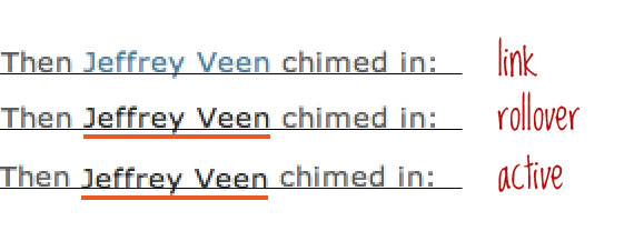
}On this site, this is a zoom-in look of the one-pixel down shift:
Concerns
On this site I use it just like the code above, meaning it affects every link on the site. Some people have said it feels like overkill. Personally I like it and like the consistency, but if you are in the overkill camp (but still like it), use more specific selectors on the anchor element to use in more specific areas of your site.
More importantly, setting a different positioning value for the active state of a link is something you need to be very careful about. If you have any links on your site that are absolutely positioned, having the active state change to relative position will (probably) make them go flying away and render them unclickable. You can fix this on a case-by-case basis by making the active state of those links retain absolute positioning, and even make their top value one higher (or bottom value one lower).
Simple and Effective
Thanks for sharing
Potentially a bit weird for tabs/images but it’s certainly effective and a nice enhancement for text links. Probably good on the iPhone too
@chris
you should insert it in snippets area.
I love it, it’s very subtle but for some reason it feels just a bit more interactive, the very subtle movement clicks in your head.
Thanks for sharing this.
Feels gimmicky to me. Oh, and “As you might imagine, it’s incredible simple. ” should be “As you might imagine, it’s incredibly simple. “
Or maybe he meant it in the sense of “wicked simple” instead of “wickedly simple”…?
After seeing this in place here for a few days, now I find this annoying and a sign of bad CSS. When I click a link and I see it jump, to me it looks like the designer mucked up something and instead of making links more usable, made then look like a mistake.
Oh, and “made then” should be “made them” … there is something about stones and glass houses you should maybe reflect on Billy Boy!
I like it … especially with the underline only on hover
I hadn’t actually noticed it before, but it is effective.
I think it’s one of those things that doesn’t jump out at you, but adds to the experience.
Thanks for the post.
Right post at right time,
today I was working on sidebar to include this effect and finally got it.
Thanks Chris…
:)
I noticed that yesterday, it’s a nice touch. Did you try it diagonally? i.e.
top: 1px; left: 1px;It feels to me like that’s what it should do, but I don’t know.
I completely agree! When I saw your comment, I immediately tried it on my own site and loved it. It will certainly be included in the next revision.
Nice little trick that, thanks
See, this right here is why I keep coming back. It’s all about the details, especially the subtle ones. Thanks!
Great little tip. I’m so adding this to my body text!
a great technique, will put it into practice. thanks!
That’s the first time I’ve ever used a tip STRAIGHT away. Copy, paste, done job. Tidy little addition to the site I’m working on. Thanks greatly.
I use it on buttons links but I don’t like it verry much on text links.
Nice trick
This style should be applied carefully. For links with position:absolute property, it will break the link position when clicked
Love it! I’m trying to imagine a scenario where I’ll have a text link with position:absolute, but I certainly appreciate the heads-up from Xitong.
The great thing about it is exactly what Chris says in the description: the subtlety. If it shifted on hover-over it might be a bit intrusive. But a quick little shift as it’s clicked? Great!
Is there a way to “void” the active state if the user:
-Clicks & Holds the link
-Rolls off the link (stay on current page)
I get stuck in the active state which isn’t huge on text links, but for buttons its pretty blatant.
I’ve just implemented this, but kept it to
p a:active, span a:activeto stop it from affecting anything major. Worked a treat. Ta!
I guess the days of just changing color are over!
Cool stuff, thanks. :)
cool idea, but i noticed if u click and hold down, but move off the link, it doesnt move back up. maybe set a “top:0” on the default state?
It’s so subtle, I didn’t even notice it until I really stared, so I don’t think it’s overkill :)
Great and subtle effect…it might be even better with less than 1 pixel (if that would be possible…)
A very nice subtle effect. I combined it with changing the opacity of the drop shadow on some icons with my links using different rgba() settings to make it look like the icon buttons were being pressed as well.
One thing about this is, if the mouse falls on the 1 pixel that you are shifting the link, it won’t click through. (the very top row)
I noticed this on a project of my own where I was shifting it a few pixels, and some clicks just weren’t working.
I’d say its pretty much a moot issue for 1 pixel, but something to be aware of if you are planning on shifting a link a bit further.
Subtlety really seems to be the key to this one.
That’s very true I just noticed it a minute ago as well.
I tried it with 2px and I noticed the same thing :(
No problem. Add some padding.
It happen the same issue with padding…
Sweet! I was just implementing something similar on a site I’m building but I was using margin-top. I love it for text links but I’ve also been using it for buttons a lot.
I’ve tried this once, and found that users liked it a bit more when color was set to a slightly darker color, as so:
a:active {

  position: relative;

  top: 1px;

  color: blue;

}
From #3680A1 (what this page uses). It gives the appearance that the elements above it are slightly casting a shadow. This page changes the color to a darker hue on rollover, so it’s not quite the same effect. (lighter color on rollover, but darker color on press would look nice.)
I mean, it’s look at feel right? Might as well come as close as possible.
Great!
thx
I noticed this the moment you released the new design, and was surprised to see that you set it on all the anchor tags.
I think it’s fine in a site that is small and doesn’t do anything too crazy, but I would do it more on a single type basis, for example only on buttons, nav links, or maybe ones with class of “ui-nudge” or something.
Still great to see you do a post on this little detail, I admire your work.
i like this style!
Great job Man… I Love It…
That a pretty cool effect. It really improves the UX, even if it’s just a tad bit. Thanks for sharing it with us Chris.
@Greg McAusland: Thanks for the heads up on the issues it might create if you’re not careful. Maybe there’s a way to tackle that?
I have never thought of doing that, works really well and looks really nice! It really does give a button feel to it. All the little things in attention to detail can really make a site fantastic.
I will be using this quite a bit I recon! Could you set the positioning so that it drops to an angle? so top:1px right 1px. etc? I guess only one way to find out :p
Thanks Chris
Cheers Chris, Never thought about this but glad you pointed out the finer details of web design. Like these smaller sort of things.
Would like to know how you create the fade effect on the leave a comment form. Looks very cool.
Cheers
Steven
This works really well, subtle and just makes the UX a little better.
Sweet, I’m having that
Hi Chris,
Do you have a tutorial on how to create that shadow rollover effect you placed on your content boxes on the right column? I love that!
Thx!
Mike
Hi Chris, I always like your stuff…
oops…. may i dislike this one? :)
I suppose you may.
Noobie question here… How to you get the text to be one color and the underline another?
It’s not an underline, it’s a bottom border
color: red;border-bottom: 2px solid blue;
I like it. I think it adds that little detail that web designers strive for but also clearly states to the end user that it is indeed a button.
I had to look at it twice, need new glass prescription.
I like it, thank you for sharing
REALLY great stuff. A little drawback, though, occurs when you click the link, hold the mouse button pressed then leaves the link. Doing so leaves the link 1px down until you click anywhere else in the page. As I said, a little drawback.
This situation happens when we are going to click a link then change our mind. Don’t know if there’s a CSS based solution for this.
Tested in FF 3.6
Cheers,
João Cunha
This is totally simple but utterly effective. As all the best tricks are.
I like it Chris – very subtle, but definitely adds something. I think I’ll try incorporating this into my updoming site redesign
Personally, I’d miss the link from the start because the blue is too close to the color of the content. Especially when you view the non-underlined links in a paragraph.
And you know what’ll improve the subtleness, a light grey line underneath the links. Especially if blue you intend to use for links is too close to the content.
Anyway, this is my personal 2 cents. :)
has anybody played with the text-shadow declaration in conjunction with a button? I’m giving active links:
position: relative;
top: 2px;
left: 1px;
color: #22aaff; /* light blue */
text-shadow: #000000 1px 0px 1px;
Now, I just have to get the active button to look right.
I haven’t, but I might look into it. Instead of having text move on a user, it would look more like a button if it does something people normally wouldn’t expect from text links. Using the shadow on a rollover for the text might make it look more smooth.