
“Your fonts render weirdly on Opera mobile.”
Thanks for taking the time to let me know. Can you send me a screenshot so I can see?
Wow that is weird. I use custom fonts, via @font-face and a third party service. This isn’t just a matter of the custom font failing and falling back to a different font, which may look weird because of different spacing and such. It appears that:
- Some characters are rendered in the correct @font-face font
- Some characters are rendered in the fallback font
- Some characters fail to render at all (box-with-x thing)
First, I know there are two different kinds of Opera mobile browsers. “Opera Mini” and “Opera Mobile”. I should bone up on that quick.
{Googles “opera mini and opera mobile”.}
Find some weird forums posts, click around a little, end up at a decent blog post that explains the difference.
In Opera Mini, the Opera Presto browser engine is located on a server. In Opera Mobile, it is installed on your phone.
The person who emailed about the font problem said it was Opera Mobile, so I’ll test that first. But as I imagine everyone in the world doesn’t know there are even different types of Opera browsers on mobile devices, I’ll test the other if I need to. It actually kinda seems like Mini might be the problem as I can imagine a server-side rendering engine might do some special shenanigans like “only wait X seconds” for third-party resources or something like that, leaving a font file half-downloaded.
I wonder if I can replicate this myself.
I have a Kindle Fire around here somewhere, but that thing has that weird Amazon Silk browser on it and I don’t think it allows me to download any other browser. I have a Nexus 7 I bought for testing on Android, but I can never get it to turn on. I got it to once but I had to take the back cover off and basically stab it with a knife until it worked. I haven’t gotten around to throwing it into a volcano yet.
Maybe I should buy a new Android device for testing that is more well reviewed. Or maybe a device that has Opera on it by default. Oh well, no time for that right this second.
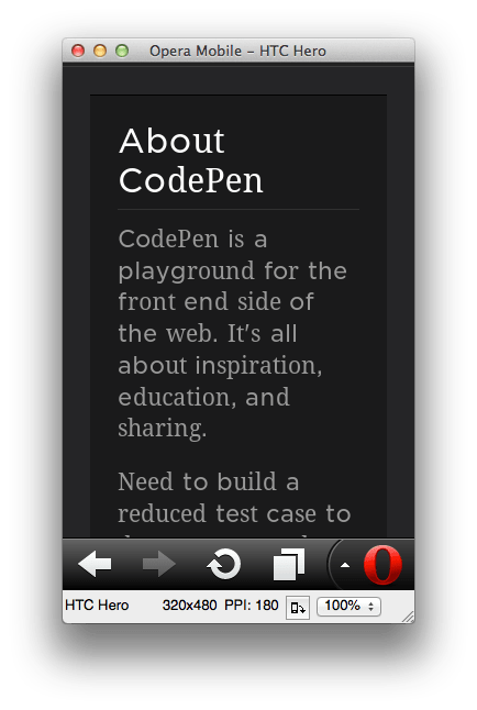
Maybe BrowerStack can emulate it for me? Ooooh it can, nice.
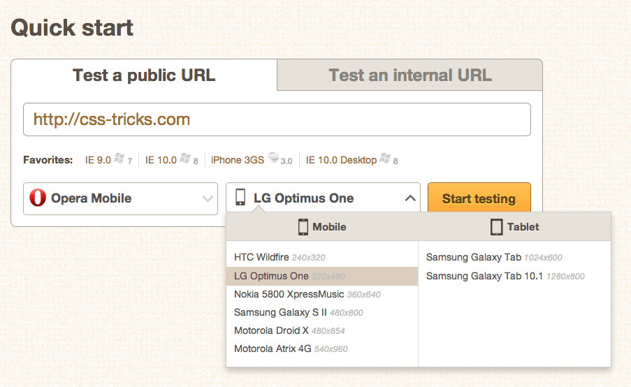
Bingo.
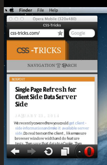
Now at least I can replicate the problem. That way if I think of something to change I can test the results. Although unfortunately there are are zero DevTools built into this emulator so it can’t help me figure out the problem by itself.
Maybe there is an emulator I can run myself? Ooooh there is! Good on ya, Opera.
While I wait for this to download I’ll Google around a little. Hmmmm, a post by Mr. Zeldman that is extremely similar. His solution was to use a third-party service (e.g. Typekit), essentially because they are in the business of getting this right. Or use a trusted tool like the Font Squirrel generator to ensure the best quality files and syntax.
Unfortunately I’m already using a third-party service (Cloud Typography), so I don’t have much control there. I’m going to keep working on this myself, but I’m going to fire off an email to them describing the issue. Most importantly so they know about it, but also because they might have a fix up I could try.
{Types up email and sends.}
OK that emulator finished downloading.
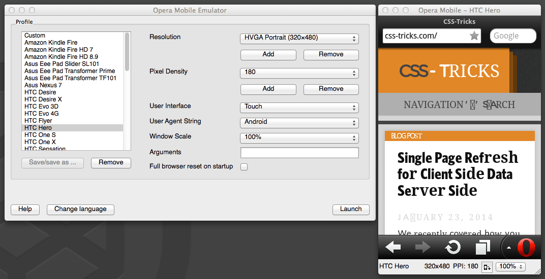
It works. Cool. The download site made it seem like you could use Opera Dragonfly to debug from this, but in reading the docs for it, it seems like you can only do that for local sites and it’s a bit of a weird setup. Plus now I look and in the version of Opera I have it’s basically the Chrome DevTools now, not Dragonfly. So I’d have to find some old version of Opera to download to do this? Uckgh I feel like this rabbit hole is getting too deep.
Maybe I should check out another site that is also using the same third-party service as CSS-Tricks. We’re using Cloud Typography on CodePen also to serve font, but totally different fonts, so that should be an interesting test too.
Ah ha! Janky in the same kinda way.
That’s the strongest lead yet. It must just be how Cloud Typography does things. Unfortunately I have fairly little control over it, because they provide the files to you and they are intentionally rather obfuscated.
I do have control on whether I serve the stylesheet at all or not though. I know I’m not ready to ditch custom fonts all together, because I like them and they generally work fine, but maybe I can ditch them somehow just for Opera Mobile.
It’s always a little tempting to try User Agent Detection. Opera provides docs on what they do there and I could always test. But I’m hesitant. Not only is it theoretically bad, but every time I’ve ever done it I’ve regretted it because it either didn’t catch what I wanted it too, caught too much, or both. Plus, I’m not finding any good-looking PHP code snippets for specifically this and I’m a better ballet dancer than RegEx writer. Do I want to head down that road again? Not really.
I could look into analytics a bit here also to see the scope of this problem. Here’s the top 10 browsers here:
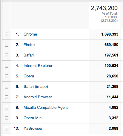
“Opera Mobile” doesn’t show up anywhere in the list, even looking at all 189 represented. It must either be lumped in with “Opera” (some portion of 1%) or “Opera Mini” (some portion of 0.1%). Mobile in its entirety is around 3% on this site, which includes iOS and Android which are far more popular. So I think this is affecting probably around 0.25% of people.
I really want to fix this, but with the super small numbers involved, the lack of good testing tools, the out-of-my-hands bits, and the potential dangers of some fixes, I feel rather helpless. I guess I’ll just wait and see what the provider has to say.
This is just a story of what it’s like being a front-end developer. It’s not even about fonts so much as the struggle, the process, and the choices.
I have a similar troubleshooting process, but at some point early on I would have stopped to get some crackers or other snacks and maybe a Red Bull.
Example:
Completely off-topic however, tell me, how can you drink sugar-free Red Bull? ;)
Chris,
I drink every kind of Red Bull (including the “zero” and the limited time flavors). I think I prefer sugar-free at this point. Original tastes too syrupy.
The other combination that provides weird results (in general not necessarily here) is Safari on Windows!
Sounds like my problem-solving with anything related to IE
bazar6, actually you “can’t” solve a problem with IE. By definition, Internet Explorer itself is a problem. :D Well, we could also say that it’s an abortion of browser.
User Agent Detection would be the fastest solution here, until either Opera or Cloud Typography fix the issue.
Here is a quick way with javascript which I believe should work:
if(navigator.userAgent.match(/Opera Mobi/)) { $('html').addClass('opera-mobile'); }Then use .opera-mobile to serve different fonts to this browser. I don’t think “Opera Mobi” would catch too much or too little. When the issue is fixed you can just remove that one line of js and a few lines of CSS and you are done.
I would use PHP:
This way, you get the added benefit; if user is Opera Mobile, don’t waste time loading resources they can’t use, and visa versa for the balance of humanity – they don’t need the Opera stylesheet.
yes!
Thanks, Chris! You have not only described about half of my work headaches (the others involve SVN and the office transitioning into scrum). I can also put that emulator to work on my own obscure mobile Opera bug that came up recently, pretty sweet.
Protip to anybody else doing front-end in a marketing setting: Marketers listen if you tell them virtually nobody but one guy in Kansas is seeing the bug. They know the numbers. Freelance clients, on the other hand… maybe just filter out clients who use lame browsers or crappy devices? Hahaha
Reads like a novel for nerds, my friend, pulling on all the heartstrings of our struggles, the moral standards we throw ourselves at. Brings to mind that once upon a recent past, developers would withhold support for a good 50% of the market share at a whack because supporting more than one browser was too time-consuming. And now we fret and toil over that 0.25%, that 190th-odd browser that haunts us as we try to please it and fail. O! The asperity!
That’s the price you pay for (pseudo) DRM :(
Out of curiosity I was testing some sites on Opera Mini for iOS this past week. Simple sites seem to not have much of a problem but when I tested the complex sites we’ve developed, all of them had problems (CSS and jQuery mostly) and as you pointed out, the number of people with this browser is so minimal that we won’t invest any time fixing the sites for this browser.
Since the page is rendered on the Opera proxy, the client also has no JavaScript engine. Meaning, there are some heuristics that tell Omini when to pull the updated version (or if it should do it at all).
241 million isn’t a small number. Opera Mini use for a site like this might be minimal, but globally, it’s huge.
http://www.operasoftware.com/smw/2013-11
Well, this is what happens with Dolphin Browser on Android 4.2.1: http://m.imgur.com/JnTcFFi
I also tried with the stock browser, the text does not overflow but the font is rendered exactly the same strange way.
If I understand correctly, Cloud Typography is paid… So if you have to pay, IMHO you should pay for a service that works. ;-)
I wouldn’t worry about “Opera Mobile/Classic” at all. It’s based on the discontinued Presto engine (best engine ever, btw <3 ) and got automatically replaced by the “Opera Browser” (which is based on Chromium) 9 months ago. It is still available because there were a few loud voices wanting it back.
I use Opera Mobile almost exclusively on my N7. Since the switch to Blink /Chromium, I no longer have problems here. I had the mentioned problem consistently before. Still do on my Linux desktop, as the newer releases aren’t running on Linux yet (and I probably won’t switch anyway due to the dramatically reduced functionality.)
About 40% of my typical workday is writing some variant of CSS, 40% is Googling, mostly Stack Overflow articles, 20% other.
Plus 1 for Stack Overflow and Google! Chris…would be nice if you had the thumbs up thing where we can increase the count on liking this reply…like who??? Stack Overflow! :o)
Is this the right time to mention how this sometimes happens to me, using Android 4.1’s stock browser (the one that’s labeled “Browser” and is shipped with CyanogenMod and custom ROMs like it)? I mean, not the crossed-up-box thing, but sometimes the heading fonts look weird, as though some have been rendered properly, but some have been rendered in a fallback font. I’ll get a screen ASAP.
I see know edit button, so here it is: http://imgur.com/XEYLPAY&hfp2OkQ It’s two images, so click the Next/Prev (I forget which) button to see the other one.
I once came across a similar problem and discovered this: http://dev.opera.com/articles/view/opera-mini-web-content-authoring-guidelines/#typography
Which seems kinda weird: “When it comes to font families, Opera Mini will only use one family of font per page, and setting font-family will have no effect, except in the case of monospace fonts where it will simulate monospace.”
An answer on SOverflow also suggested that it is related to the meta-tag “screen vs “handheld”:
http://stackoverflow.com/questions/5593828/opera-mini-and-css
Not sure that helps at all, but interesting peoblem. Keep us posted if you solved it?
This will come off pretty crass, but here’s my process:
Look at Analytics
Say “eff it” to all browsers < 1%.
I think that’s sometimes fair. We were doing that to IE 6 well before it was 1%. Although it’s important to consider: 1% and growing or 1% and dropping? In this case, it might be dropping as well, since the switch to Blink.
To turn on a nexus 7 just hold power button for a minute, somehow nexus 7 and turning on are things that don’t go well together xD
My 1st gen Nexus 7 either takes around a minute of holding the power button or about 10 seconds. Either way, I still like it in general.
Viewing this currently with Android and seeing same “weird” fonts in the header. Especially with the bolded fonts. No boxes but definitely different fonts.
BTW Chris, it’s quite strange that you, as a front-end developer, don’t have an Android device for testing. :P I think it’s important because fortunately it’s what you find on most devices now, the nasty iOS is luckily being only relegated to Apple “stuff”. :)
But if you are still considering to throw the Nexus away, I will happily pay you the shipping cost to send it to my place. :D Eh eh just kidding. ;)
With Opera Mobile and Dragonfly you can debug external sites! The local IP address is just used by Opera to connect to the emulator. You can probably even run Opera Dragonfly on one machine and debug site running in emulator on another machine. Site has nothing to do with it. Unfortunately as for now you cannot do this with newest Blink-based Opera desktop and mobile.
I used to use Opera Mini on an old feature phone because it was a massive improvment on the default browser. I can’t believe it’s still available on Android and being advertised as the ‘fastest browser’ when all it does is strip out support for things like web fonts.
Same issue on Blackberry’s WebKit browser for me, I’m afraid. Don’t know how to screenshot a blackerry. It’s the Bold, with physical keyboard.
Another issue with the site is that the browser crashes when trying to type a comment for the first time – fine after the first crash (seems to be memory related).
This does not only sound familiar but seems like my day-to-day routine when developing.
What you forgot to mention though is the moment of relief whenever you actually can find a working solution, implement it and feel proud enough to stroke your geeky beard again for a few minutes (until the next strange problem you would have never thought of strikes).
Consider visiting an Open Device Lab near you to test and reproduce this behavior on real devices? It might help to get insights, be able to debug and track it down…
On the other hand, have you tried to fetch the font source, and analyze it? Do they serve SVG Fonts? If yes, this is a pretty good way to track issues.
So your solution was to wring your hands and see what google knows about it for about half an hour while you downloaded some emulators to see if you could see it too? Then after you’d confirmed it was a bug with these cloud people (and that there are only 3 opera users in the world) you sent an e-mail saying “help me/fix it!” ? herculean effort, my son. Truly, this is my dream job if that counts as work and you can get paid to do it.
And your approach?
Scott, his/her approach would probably have been to just reply “it’s not my fault, ROTFLOL you stupid user” even if (he/she) made up the web fonts (him/her)s elf.
On the other hand, Chris isolated the problem in a proper way and arrived to a reasonable conclusion that it’s Cloud Typography’s fault because those are the guys who are making the weird web fonts. But you know, it’s just so easier to troll on a blog (without putting either a name or a website URL) than it is to do real work.
Burying because it’s an anonymous criticism, and thus trolling. The criticism is fine. Feel free to re-post with a real name and email.
Why are you locked into using Cloud Typography? I assume they are paid fonts and the license only allows them to serve. If you can control the @fontface CSS file, try something like this. This has worked for me in the past to fix Chrome rendering issues.
Maybe telling certain browsers to serve a certain format first will resolve. I’ve seen the issue on your site on an Android browser (not sure which, but I feel like it was Chrome or default Android).
If that doesn’t fix, I would use FontSquirrel to generate either the same fonts (if the license allows), similar fonts (you could use this to find similar free-to-use options, or maybe you could target Android-only and replace the the fonts with variants of Roboto, Roboto-condensed, & Open/Noto Sans. These are included in Android 4 and up.
I’m not locked in, I choose to use them because I like them and that’s the only way these fonts are available.
You’re right though, and that was Zeldman’s fix above, is to get control over the font files themselves, run them through the FontSquirrel generator, and use that code.
Chris, fonts are working perfectly on Android now. Great! :)
I believe that a good code snippet may come out of all of this (?), one that can be used as a standard (??). By far, in my humble experience at least, Fontsquirrel’s is the best approach.
One has to remember though that (depending on the license) you must provide a way to protect the font files as well (i.e.: not leave them out there, all easy to download), for which said snippet should be accompanied by at least an Apache rule that would block direct access to the font file, while leaving it able to function properly when used in your website.
Having said that, this is why I would prefer fonts with an open license ;)
Im still holding out hope that all the browsers eventually decide to use the same rendering engine. That way the web can really move forward into the future.
I don’t really know why but CodePen doesn’t work well on my Dolphin Beta (Android 4.0; HTC Wildfire)
It might seem weird: But I like that serif-sans-serif combination.
Interesting read, great depiction of the thought process actually.
Yeah this isnt just opera. I see the same issue on android stock browser 4.2.1
Have been meaning to let you know but kept forgetting.
Seems then that based on the analytics and the comments above the number of users affected is much greater than initially thought.
You are definitely right. Oddly enough, it seems that the developers at Cloud Typography didn’t test their stuff on something which is not an Apple super-proprietary trap. This is somehow strange!
Loved reading this. I thought everyone but me just snapped their fingers and instantly knew the answer to stuff like this. Nice to know I’m in good company. : )
Also, an Android virtual machine might be able to accurately reproduce this and future issues. Check out Android-X86 or AndroVM. These are free, work with Virtual Box (also free), and you can change the resolution to emulate a tablet or phone. Or you could install Google’s Android SDK, which is way slower and more trouble IMO. It has an emulator as well.
Awesome post
It’s after a reading a ‘story’ like this…one that is so familiar, that i begin to question where it all went wrong in my life…sniff. Screw this, I’m done! Goodbye cruel world wide web…see you tomorrow
The same thing is happening to me on the Android stock browser (4.3), but I usually use Chrome (which looks fine) so I wouldn’t have noticed if it hadn’t been for this post.
Next time someone asks me how things are at work, I’ll send them this post.
But seriously, I check the analytics first, not as a last resort.
This isn’t much different than problem solving in general. Front-end, back-end all the way back down to algebra where instead of browsers we’d be solving for X.
Great article!
I remembered a post by Jeffrey Zeldman who had the same issue once.
In his case it was caused by the type the fonts are delivered: in two parts. In some cases the browser only loaded one part of a font, causing the same type of issue you faces here.
If I look in the webkit inspector I see
font-family: 'Whitney Cond A', 'Whitney Cond B', ronnia-condensed, sans-serif;: maybe it is the same issue?Back to the Energy Drink conversation… Before you hate on my recommendation–just try it once: Monster Ultra. It’s in a white can and it’s so much better than all the other Energy Drinks out there. It’s smooth, unlike the rest of the Monster line, which taste too much like a liquid Jolly Rancher; it’s caffeinated perfection. IMHO.
Lance, well, I guess we are supposed to be here in order to talk about web development, not for promoting a specific brand of energy drink. :P
Sometimes a simple design can do wonders :) Too much of coding and skeuomorphic design can be a pain.
Also, why don’t you too change to flat design when world is? It would look cooler!
“cooler” or not, that’s a matter of taste. Personally I am part of those who think that doing something just because somebody is doing it (or especially because Microsoft is doing it) does not mean it’s cool, quite the opposite. Some trends are nice, some other are just a futile mode which tends to vanish in the long term. :)
Hi CHris,
I am only faced it type problems server slow or custom fonts. i don’t love wired problems it is hard to fix
Ergo i Love simple developing.
Sadly Chris, this damages my image of you in a way that’s hard to take. For whatever reason I’ve assumed up to now that you’ve not just had the answers, but the correct ones too! Getting to the end of this story and learning that you hadn’t come up with a perfect solution has brought me to the depths of despair.
That’s precisely why I think his videos where he thinks out loud are so good. I’m far more interested in getting the thought process right that the actual solution.
Thanks for this article. I am the only front end developer in my workplace, so it’s great for me to read about the process of problem solving by someone else.
As a side note… due to website blocking at my workplace I am able to view this website, but it renders without the stylesheet. That is to say, CSS-Tricks without any CSS!
We’re looking into this exact same issue at my company now. Well, almost the same issue; just the missing glyphs thing with Whitney on Android Gingerbread, we don’t have the same ransom-note thing you do. I’ve successfully ruled out it being an actual character in the markup. Charles Proxy and its integrated hex editor were involved in that experiment.
Current theories include it being a bizarre ligature or some kind of content being delivered with
:beforesorcery. I hope to get H&FJ on the horn within the next week or so to get to the bottom of this. Funny timing though, I was alerted to this issue within my org maybe a day before you posted this. I’ll let you know how it shakes out.I am also having a similar issue but with Chinese Characters. Is there any Chinese fonts that can be supported by all browsers?
As Eelco Deuling wrote in his comment Cloud Typography tries to protect its webfonts by splitting it into two files. Some letters are delivered in Version A, some in Version B. They pair the two fonts as a font stack.
Opera Mini does only use one variant (Ben’s comment).
As long as Cloud Typography is splitting up its font files (DRM, höhöhö) or Opera Mini doesn’t accept more then one style per font family this problem can’t be solved.
By the way: The desktop version of Opera (at least here at Ubuntu 12.04) also shows the wrong font for the basic text. After loading it uses the bold italic (of Whitney?), after clicking a link and coming back the font is bold and smaller but using the spacing as before. Catastrophic.
I normally view the site in a desktop browser but at the moment I’m using Feedly on an Android phone and the fonts are also janky. No big deal but I’m curious what Feedly uses to view sites.
It’s nice to look inside the thinking of a developer I respect. I just thought every other developer instantly knew the answer to everything. Phew!
Pure quality! This is like a diary of my everyday struggles in mobile / front-end dev. Nice one Chris….you brightened my day.
Great post, having whitespace is always good practice, having headers in your posts is important as well, thanks for sharing the value!
Quick 2 cents on this. I examined the resources panel and under fonts there seemed to be a huge number of files loaded for even 1-2 typefaces. Cloud.typography splits up the files and serves the characters according to what the page needs first (haven’t verified this but that seems the strategy). So, if network connection drops a few files, you’ll get janky rendering. Don’t really know whether this can be fixed with any JS test which detects which characters have loaded and which haven’t. Sorry, but I suck at JS :)
Hey Chris, did you consider using a remote rebugger such as Weinre? It struck me that this might have been very useful (it is daily for me) and a quick search of the page didn’t show anyone else as mentioning it yet. It’s a great tool for mobile testing.
This is one of the many many reasons webfonts are Not A Good Thing. Users don’t care about a SLIGHTLY prettier font. They do care about readability and speed. (I don’t make this up. Studies do.)
That volcano bit was awesome xD
Thank you for mentioning the Opera Emulator, didn’t know they had one!!
If you can’t be bothered the headache to figure this out, report the problem to CodePen, then wait to see what they do to fix it. ;-) (Which is merely cheekier than what’s probably the right answer: ping Cloud Typography support.)
Also getting this on my website when viewing in Qt Webkit, bluebook.io which is using cloud.typography, would love to know if you fix it