Many designers still think in px first when creating baseline styles. But we know intellectually that various relative typography approaches are better suited to our medium in all its complexity. Better for accessibility. Better for avoiding bizarre typographic disasters linked to user preference settings, device limitations, and the unforeseen ways our overwrought styles can interact with one another.
As I contemplate a long-overdue redesign of my own site, it’s worth taking a refreshing dip into what we’ve learned about web typography over the past 20+ years. From the pages of (where else?) A List Apart:
Bojan Mihelac: “Power to the People: Relative Font Sizes” (2004)
An early and simple creative solution for text resizing that respects users’ choices and also gives them an additional option for resizing despite the limitations of some of the most popular browsers of the day. Presented for its historical importance, and not as a how-to for today. https://alistapart.com/article/relafont/
Lawrence Carvalho & Christian Heilmann: “Text-Resize Detection” (2006)
Detect your visitors’ initial font size setting, and find out when they increase or decrease the font size. With this knowledge, you can create a set of stylesheets that adapt your pages to the users’ chosen font sizes, preventing overlapping elements and other usability and design disasters. Presented for its historical importance as an insight into the complex dancing we’ve done in the past to ensure readability. https://alistapart.com/article/fontresizing/
Richard Rutter: “How to Size Text in CSS“ (2007)
Sizing text and line-height in ems, with a percentage specified on the body (and an optional caveat for Safari 2), provides accurate, resizable text across all browsers in common use today. An early move toward more responsive type and away from the accessibility problems created by setting text sizes in px in some browsers and devices. https://alistapart.com/article/howtosizetextincss/
Wilson Miner: Setting Type on the Web to a Baseline Grid
The main principle of the baseline grid is that the bottom of every line of text (the baseline) falls on a vertical grid set in even increments all the way down the page. The magical end result is that all the text on your page lines up across all the columns, creating a harmonious vertical rhythm. https://alistapart.com/article/settingtypeontheweb/
“We must now practice a universal typography that strives to work for everyone. To start, we need to acknowledge that typography is multidimensional, relative to each reader, and unequivocally optional.” https://alistapart.com/article/flexible-typesetting/
Keep going…
For more web design community wisdom and web typography history, see Typography & Web Fonts in A List Apart, for people who make websites.
And in the Comments below, please share your favorite resources for creating websites that look great and read beautifully, no matter what technical and human capabilities get thrown at them.
It’s Sunday; I’m playing with my music collection, content as a fed-and-burped babe. Allow me to explain.
I realized last night that, in tracking my shifting musical tastes via my Last.fm Pro account, I’m basically remaking “Pardon My Icons,” the creative project I launched on this very website in 1995, back when it was still at a tilde address (it did not become zeldman.com until ’96), and which first brought my work to the attention of other creatives who were also discovering the early web and making it their own.
Me, collage, and music
Although I was not serious about it, I started making collage art when I lived in Washington DC in my 20s.
Back then I was serious about composing and producing. I used an Akai 12-track recorder, a rack of synth modules commanded by my Yamaha DX7 with a custom E! card, and a PC running Personal Composer MIDI, arranging, and composition software. I also had an old Selmer Bundy flute, an African reed instrument whose name I forget (and whose “reed” turned out to be a dried locust carcass, as I would discover, to my horror, when the instrument broke), Fender amps, mics, and a variety of percussion instruments with which I made music in my Washington, DC-based recording studio. But that’s a whole ’nother story.
I did not expect to earn a living as a composer, and in that negative expectation I was more than amply fulfilled.
The paper’s arts section editor in those days was named Richard. I’d gotten his attention without soliciting it after creating “Khz” for City Paper. Khz was my weekly music column. I covered the emerging go-go and hardcore scenes, as they were what was happening in DC, and the whole country would soon be listening. Naturally, the Post made me stop writing about that interesting and relevant stuff, and instead paid me $40 per to crank out anodyne concert reviews of mainstream artists like Kenny Rogers when their tours came through DC. (I was comped to the ticket but paid my own travel and gas out of the 40 bucks.)
I typically had 30 minutes from the time the headliner started to call in my review, which meant I had to write it in my head while watching the beginning of the performance, then run to a pay phone booth (kids, ask your parents) and dictate it aloud to someone on the copy desk, before the concert had even begun to build up a head of steam. This wasn’t fair to the artists. I did the best job I could under the circumstances, taking pride in how quickly I could structure and ship a news story. Richard fired me before I could quit, but that, too, is another story.
Most importantly at that time, I lived with a girlfriend. She was an artist and architect who had left that career to study computer programming. We were social (many friends, drinking was often involved), and serious about our art—which, in my case, was music, even if I earned my living writing concert reviews and crafting passable but hardly brilliant ads.
Through all of those ups and downs, and to the side of those major efforts, I kept at the collage for years, putting in several hours a night making the things. When each was finished—and deciding that any art product was finished was damned tough for my restless young mind—I would carefully frame it behind glass, and mount it on the walls of our apartment.
Was it art? Just a hobby? Who knows? It made me happy.
And then gradually, as I put more effort into my music and ad careers, I set the collage-making aside, for a time.
New career in a new town
Ten years later, I was a New York art director and copywriter, two years sober, and no longer in that same romantic relationship. That’s okay, I was in a new one.
I’d packed my music studio equipment—now obsolete because Akai stopped making the proprietary multitrack tape format that their 12-track unit ran on—in a storage unit. Eventually I’d give away all that music and recording equipment (keeping only the multitrack masters), but that, too, is another story.
The client was Warner Bros., the project was “Batman Forever,” our visionary client was Donald Buckley, my partners were Steve McCarron, Alec Pollak, and Doug Rice, and the website was a huge hit, attracting half the people who visited the early web. (Alec’s “Flashback 1995: batmanforever” shares screenshots, which are great, although they cannot convey what a breakthrough the site was in March, 1995.)
With 3 million people using the web in 1995, the site got 1.5 million visits a day for over a year. Not bad.
Pardon my icons (1995)
I immediately set to work creating a personal site (this one), and Pardon My Icons was one of its first “entertainments.”
As is often the case with my creative efforts, I made these tiny, Warhol-inflected bits of art as a protest against what I saw as the mediocrity of the icons in general use on that early, early web.
(Similarly, my friends and I would later start The Web Standards Projectin protest against the dumb ways most folks were being told to create websites, e.g. using proprietary tags instead of W3C and ECMA standards, because browsers didn’t properly support those. Having lost access to my musical master tapes because I’d invested in Akai’s non-standard and eventually discontinued tape format, I was kind of keen on not letting the internet fall victim to the same kind of nonstandard f*ckery. But that, too, is another story. We are gathered here to talk about icons and collage. So let’s do that:)
A mental break
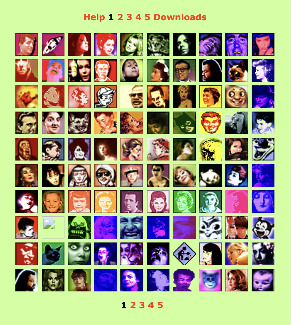
I track my music on Last.fm Pro. Here’s my account. (But don’t look unless you, too, have a Pro account. I’ll explain why in a moment.)
Some of the artists I listen to, as shown on last.fm Pro.
Last.fm lists the artists you play, arranging them by the number of plays. Thus, if you were to play three tracks by Freddie Gibbs and two by Bill Evans, you’d have a collage featuring those two artists, with Freddie preceding Bill because he has one more play than Bill.
But if you play three tracks each of Freddie Gibbs and Bill Evans, then Bill will come first, because Bill comes before Freddie alphabetically.
Through such moves, over time, an ever-shifting collage unfolds. But only in Last.fm Pro.
In regular, free old last.fm, you can see other people’s artists as a list, arranged by number of plays, interrupted by an ugly barrage of ads. This is a useful free service for those who are curious about what their friends listen to. But it is a list, not an artful collage, of course.
Collage for days
In Pro, you can see their artists and yours as an ad-free collage that goes on for pages and pages. Plus, as a Pro user, you can choose which photo represents which artist—and even upload your own. When viewing your collection, you and your visitors will see a collage of your favorite artists, in descending order of plays (and with the English alphabet deciding who at each play count precedes whom), using artwork you not only select, but you can also create and upload to the service.
I like Pro. And even though the product isn’t exactly in what you’d call hyper active development—even though the server isn’t always fast, even though there are a few bugs that will probably never get fixed, even though new features are introduced rarely, and the company’s customer service department isn’t exactly the most active help desk in tech—despite those minor drawbacks, the site does things no other website can do. And at US $3, the Pro account isn’t exactly priced out of reach for most customers. (If you can afford a computer, internet access, a music collection and/or a music streaming service, you can probably scratch the 3 bucks together as well.)
How to collage on last.fm
By controlling what I listen to, and the order in which I listen, I’m slowly building an infinite collage of my evolving musical tastes.
By choosing or finding the artist photos (often post-producing them in Photoshop), I create my mood, my rhythm, and my shifting color palettes.
There are design rules governing where portraits should be placed. For instance, people whose face or gaze points rightward get placed on the left of the grid, so they lead the viewer’s eye from left to right, into the composition, whereas those who gaze to my left belong on the right side, leading the viewer’s eye back in.
To reposition someone, I may listen to a few extra plays of them. Or use last.fm’s Pro Admin to subtract a few plays.
When I started using Last.fm, I merely wanted a visual record of what I was listening to, and when I listened. But as you may have inferred, an accurate count of everything I’ve listened to over the past years is no longer my goal in using last.fm; the goal is now the endless collage.
It’s kinda spiritual.
(Reminder: the only way to see it is to be a Pro member of last.fm, which turns off ads and enables you to view your own and other people’s collections in a grid format instead of a list. If you’re a non-member, you see a list jammed with ads.)
If a tree falls, is it art?
Unlike the real-world collages I made in my 20s (which could be mounted on a wall), and unlike 1995’s “Pardon My Icons” (which could be viewed in any browser connected to the web), my current art-making/hobby activity is not publicly viewable except by last.fm Pro users. And that’s okay. ’Cause I’m not designing this for anyone besides myself to enjoy. I mean, if you see it, cool. But if nobody ever sees it, engaging with it will still make me happy.
Which makes this collage business—what? Therapy? Gaming? (Just of a different sort than anybody else?) A form of stimming? It definitely helps lower my general anxiety, providing a space where I can make pretty pictures while listening to my favorite music, which, driven in part by the desire to expand the collage, is widely inclusive and always expanding.
The hunt for fresh collage material also helps keep me interested in new music. (Readers who feel stuck, take note.) And my collage-making, however unimportant it may be, also provides a needed mental health break during these hellish times.
I do this activity every weekend when my more normal friends are biking or baking or dancing.
Is this activity, into which I’ve now poured many hours of my life, artistry or autism? Who cares? The point is that it’s escapist and harmless and we all need some of that in our lives, however we can grab it.
However you grab your moments of calm, meditation, and happiness, never be ashamed of taking care of yourself.
See also…
Rediscovering music: If Spotify exposes you to new music other people are listening to, Last.fm helps remind you of great music in your existing collection that may have slipped your mind.
For love of pixels: Stroll with us down memory lane as we celebrate the pearl anniversary of pixel art creation’s primary progenitor, and some of the many artists and design languages it inspired.
Blue Beanie Day is everywhere! Here astronaut Bowman from 2001: A Space Oddysey flaunts his basic blue toque, couresty of Kevin Cornell (illustration) and Douglas Vos (inventor of the holiday).
Saturday, 30 November 2024, marks the 17th annual Blue Beanie Day celebration. It’s hard to believe, but web standards fan Douglas Vos conceived of this holiday way back in ’07:
The origin of the name of the holiday is the image of Jeffrey Zeldman on the cover of his book wearing a blue knit cap.[7][8][9] Over the years, the Blue Beanie Day also became an action day for web accessibility, for which the correct use of web standards is a basic requirement.[8] — Wikipedia
How can you join this year’s fun? That’s easy! Snap a self-portrait wearing a blue beanie and post your Blue Beanie Day photo to Bluesky, Threads, Instagram, Tumblr, LinkedIn, Facebook, your blog (you’ve still got one, right?), and whatevs. Hashtag: #BlueBeanieDay.
ONE MONTH and 24 years ago, in “Where Have All the Designers Gone?” (my HTMHell design column for Adobe of March 20, 2000), I discussed the deepening rift between aesthetically focused web designers and those primarily concerned with creating good experiences online:
More and more web designers seem less and less interested in web design.
Over the past 18 months or so, many of the best practitioners in the industry seem to have given up on the notion that a low-bandwidth, less than cutting-edge site is worth making. Much of the stuff they’ve been making instead has been beautiful and inspiring. But if top designers wash their hands of the rest of the Web, whose hands will build it, and whose minds will guide it? The possibilities are frightening.
An Imperfect Medium for Perfectionists
Why were many of the leading graphic designers and studios at the time uninterested in web design? For one thing, designers trained to strive for visual perfection found the web’s unpredictability depressing. The article provided clues to the frustrations of the time:
Good designers spend hours tweaking typography in Illustrator and Photoshop. Then visitors with slow connections turn off images.
Of course, where professionals trained in graphic design saw a distressing lack of control, others glimpsed in the infant technology a tremendous potential to help people, pixel-perfection be damned. To reduce the conflict to a cartoon, you might characterize it as David Carson versus Jakob Nielsen—though doing so would trivialize the concerns of both men. Designers already charged with creating websites found themselves somewhere in the middle—barking themselves hoarse reminding clients and managers that pixel-perfect rendering was not a thing on the web, while arguing with developers who told designers the exact same thing.
Visually inspiring websites like K10k showed that the web could, if approached carefully and joyfully, provide aesthetic delight. But many designers (along with organizations like AIGA) were unaware of those sites at the time.
Us and Them
Another source of tension in the medium in 2000 sprang from the discrepancy between the privileged access designers enjoyed—fast connections, up-to-date browsers and operating systems, high-res monitors (at least for the time) offering thousands of colors—versus the slow modems, aging and underpowered computers, outdated browsers, and limited-color monitors through which most people at the time experienced the web.
Which was the real design? The widescreen, multicolor, grid-based experience? Or the 216-color job with pixelated Windows type, a shallow “fold,” and pictures of headline text that took forever to be seen?
To view your masterpiece the way most users experienced it, and at the syrup-slow speed with which they experienced it, was to have an awakening or a nightmare—depending on your empathy quotient. Some designers began to take usability, accessibility, and performance seriously as part of their jobs; others fled for the predictability of more settled media (such as print).
A New (Old) Hope
My March, 2000 article ended on an upbeat note—and a gentle call to action:
For content sites to attain the credibility and usefulness of print magazines; for entertainment sites to truly entertain; for commerce sites and Web-based applications to function aesthetically as well as technically, the gifts of talented people are needed. We hope to see you among them.
That was my hope in 2000, and, all these years later, it remains my vision for this web of ours. For though the browsers, connections, and hardware have changed substantially over the past 24 years, and though the medium and its practitioners have, to a significant extent, grown the Hell up, beneath the surface, in 2024, many of these same attitudes and conflicts persist. We can do better.
Minus the framesets that formerly contained it, you may read the original text (complete with archaic instructions about 4.0 browsers and JavaScript that broke my heart, but which Adobe’s editors and producers insisted on posting) courtesy of the Wayback Machine.
So, I’m a web designer. And I also specialise in accessibility, design systems, and design.
…Why do I think that this is the best title? Here’s why.
I’m designing for the web. The infinitely flexible web. The web that doesn’t have one screen size, one browser, one operating system, or one device. The web that can be used by anyone, anywhere, on any internet connection, on any device, on any operating system, on any browser, with any screen size. I’m designing with the web. Using the web platform (HTML, CSS, JS, ARIA, etc.), not a bloated harmful abstraction. I have a deep understanding of HTML and its semantics. I love CSS, I know how and when to utilise its many features, and I keep up-to-date as more are added. I have a strong understanding of modern JavaScript and most importantly I know when not to use it.
The Wax and the Wane of the Web (2024): Forget death and taxes. The only certainty on the web is change. Ste Grainer takes a brief look at the history of the web and how it has been constantly reinvented. Then he explores where we are now, and how we can shape the future of the web for the better. – A List Apart
The Cult of the Complex (2018): If we wish to get back to the business of quietly improving people’s lives, one thoughtful interaction at a time, we must rid ourselves of the cult of the complex. Admitting the problem is the first step in solving it. – A List Apart
Dear AIGA, where are the web designers? (2007): For all the brand directors, creative directors, Jungian analysts, and print designers, one rather significant specimen of the profession is missing. – zeldman.com
Standardization and the Open Web (2015): How do web standards become, well, standard? Although they’re often formalized through official standards-making organizations, they can also emerge through popular practice among the developer community. If both sides don’t work together, we risk delaying implementation, stifling creativity, and losing ground to politics and paralysis. Jory Burson sheds light on the historical underpinnings of web standardization processes—and what that means for the future of the open web. – A List Apart
You may not know his name, but he played a huge part in creating the web you take for granted today.
As the first person to realize, way back in 1994, that the emerging web could be a playground, he created Cool Site of the Day as a single-focused blog dedicated to surfacing interesting sites, thereby demonstrating the web’s potential while creating its first viral content. (As an example, traffic from his followers, or, as we called them back then, readers, brought NASA’s web server to its knees.)
He co-founded The Web Standards Project, which succeeded in bringing standards to our browsers at a time when browser makers saw the web as a software market to be dominated, and not a precious commons to be nurtured.
He anticipated responsive web design by more than 20 years with his formulation of Liquid, Ice, and Jello as the three possible ways a designer could negotiate the need for meaningful layout vis-a-vis the unknowns of the user’s browsing environment.
He taught the web DHTML through his educational Project Cool Site.
And then, like a handful of other vital contributors to the early web (e.g. Todd Fahrner and Dean Allen), he vanished from the scene he’d played so large a role in creating.
He’s ba-ack
Glenn Davis wasn’t always missed. Like many other creators of culture, he is autistic and can be abrasive and socially unclueful without realizing it. Before he was diagnosed, some people said Glenn was an a**hole—and some no doubt still will say that. I think of him as too big for any room that would have him. And I’m talking about him here because he is talking about himself (and the history of the early web) on his new website, Verevolf.
If you go there, start with the introduction, and, if it speaks to you, read his stories and consider sharing your own. That’s how we did it in the early days, and it’s still a fine way to do it—maybe even the best way.
I knew Glenn, I worked with him and a lot of other talented people on The Web Standards Project (you’re welcome!), and it’s my opinion that—if you’re interested in how the web got to be the web, or if you were around at the time and are curious about a fellow survivor—you might enjoy yourself.
Our static tools and linear workflows aren’t the right fit for the flexible, diverse reality of today’s Web. Making prototyping a central element of your workflows will radically change how you approach problem solution and save you a lot of headaches – and money. But most importantly, you will be creating the right products and features in a way that resonates with the true nature of the Web. A discourse on processes, flexibility, the Web as a material, and how we build things.
SORRY. I disagree. Nonsemantic classnames that refer to visual styles will always be a bad idea.
I’m sure you’re a good coder. Probably much better than I am these days. I know most of you weren’t around for the standards wars and don’t know how much damage non-semantic HTML and CSS did to the web.
I’ve worked on big sites and I understand how bloated and non-reusable code can get when a dozen people who don’t talk to each other work on it over a period of years. I don’t believe the problem is the principle of semantic markup or the cascade in CSS. I believe the problem is a dozen people working on something without talking to each other.
Slapping a visually named class on every item in your markup may indeed make your HTML easier to understand for a future developer who takes over without talking to you, especially if you don’t document your work and create a style guide. But making things easier for yourself and other developers is not your job. And if you want to make things easier for yourself and other developers, talk to them, and create a style guide or pattern library.
The codebase on big sites isn’t impenetrable because developers slavishly followed arbitrary best practices. The codebase is broken because developers don’t talk to each other and don’t make style guides or pattern libraries. And they don’t do those things because the people who hire them force them to work faster instead of better. It starts at the top.
Employers who value quality in CSS and markup will insist that their employees communicate, think through long-term implications, and document their work. Employers who see developers and designers as interchangable commodities will hurry their workers along, resulting in bloated codebases that lead intelligent people to blame best practices instead of work processes.
The present is always compromised, always rushed. We muddle through with half the information we need, praised for our speed and faulted when we stop to contemplate or even breathe. Frameworks built on newish worst practices seem like the way out, but they end up teaching and permanently ingraining bad habits in a generation of web makers. Semantics, accessibility, and clarity matter. Reusability is not out of reach. All it takes is clarity and communication.
2006 DOESN’T seem forever ago until I remember that we were tracking IE7 bugs, worrying about the RSS feed validator, and viewing Drupal as an accessibility-and-web-standards-positive platform, at the time. Pundits were claiming bad design was good for the web (just as some still do). Joe Clark was critiquing WCAG 2. “An Inconvenient Truth” was playing in theaters, and many folks were surprised to learn that climate change was a thing.
I was writing the second edition of Designing With Web Standards. My daughter, who is about to turn twelve, was about to turn two. My dad suffered a heart attack. (Relax! Ten years later, he is still around and healthy.) A List Apart had just added a job board. “The revolution will be salaried,” we trumpeted.
Preparing for An Event Apart Atlanta, An Event Apart NYC, and An Event Apart Chicago (sponsored by Jewelboxing! RIP) consumed much of my time and energy. Attendees told us these were good shows, and they were, but you would not recognize them as AEA events today—they were much more homespun. “Hey, kids, let’s put on a show!” we used to joke. “My mom will sew the costumes and my dad will build the sets.” (It’s a quotation from a 1940s Andy Hardy movie, not a reflection of our personal views about gender roles.)
Jim Coudal, Jason Fried and I had just launched The Deck, an experiment in unobtrusive, discreet web advertising. Over the next ten years, the ad industry pointedly ignored our experiment, in favor of user tracking, popups, and other anti-patterns. Not entirely coincidentally, my studio had just redesigned the website of Advertising Age, the leading journal of the advertising profession.
Other sites we designed that year included Dictionary.com and Gnu Foods. We also worked on Ma.gnolia, a social bookmarking tool with well-thought-out features like Saved Copies (so you never lost a web page, even if it moved or went offline), Bookmark Ratings, Bookmark Privacy, and Groups. We designed the product for our client and developed many of its features. Rest in peace.
I was reading Adam Greenfield’s Everyware: The Dawning Age of Ubiquitous Computing, a delightfully written text that anticipated and suggested design rules and thinking for our present Internet of Things. It’s a fine book, and one I helped Adam bring to a good publisher. (Clearly, I was itching to break into publishing myself, which I would do with two partners a year or two afterwards.)
In short, it was a year like any other on this wonderful web of ours—full of sound and fury, true, but also rife with innovation and delight.
As part of An Event Apart’s A Decade Apart celebration—commemorating our first ten years as a design and development conference—we asked people we know and love what they were doing professionally ten years ago, in 2006. If you missed parts one, two, three, or four, have a look back.
RACHEL ANDREW—longtime web developer and web standards champion, co-founder of the Perch CMS, and author of Get Ready For CSS Grid Layout—is my guest on today’s Big Web Show. We discuss working with CSS Grid Layout, how Grid enables designers to “do something different” with web layout, why designers need to start experimenting with Grid Layout now, how front-end design has morphed into an engineering discipline, learning HTML and CSS versus learning frameworks, and the magic of David Bowie, RIP.
IN “CONTENT Display Patterns” (which all front-end folk should read), Dan Mall points to a truth not unlike the one Ethan Marcotte shared last month on 24 ways. It is a truth as old as standards-based design: Construct your markup to properly support your content (not your design).
Modular/atomic design doesn’t change this truth, it just reinforces its wisdom. Flexbox and grid layout don’t change this truth, they just make it easier to do it better. HTML5 doesn’t change this truth, it just reminds us that the separation of structure from style came into existence for a reason. A reason that hasn’t changed. A reason that cannot change, because it is the core truth of the web, and is inextricably bound up with the promise of this medium.
Separating structure from style and behavior was the web standards movement’s prime revelation, and each generation of web designers discovers it anew. This separation is what makes our content as backward-compatible as it is forward-compatible (or “future-friendly,” if you prefer). It’s the key to re-use. The key to accessibility. The key to the new kinds of CMS systems we’re just beginning to dream up. It’s what makes our content as accessible to an ancient device as it will be to an unimagined future one.
Every time a leader in our field discovers, as if for the first time, the genius of this separation between style, presentation, and behavior, she is validating the brilliance of web forbears like Tim Berners-Lee, Håkon Wium Lie, and Bert Bos.
Every time a Dan or an Ethan (or a Sara or a Lea) writes a beautiful and insightful article like the two cited above, they are telling new web designers, and reminding experienced ones, that this separation of powers matters.
And they are plunging a stake into the increasingly slippery ground beneath us.
Why is it slippery? Because too many developers and designers in our amnesiac community have begun to believe and share bad ideas—ideas, like CSS isn’t needed, HTML isn’t needed, progressive enhancement is old-fashioned and unnecessary, and so on. Ideas that, if followed, will turn the web back what it was becoming in the late 1990s: a wasteland of walled gardens that said no to more people than they welcomed. Let that never be so. We have the power.
As Maimonides, were he alive today, would tell us: he who excludes a single user destroys a universe. Web standards now and forever.
EVERY TIME I hear a young web developer cite the BBC’s forward-thinking practice of “cutting the mustard,” by which they mean testing a receiving web device for certain capabilities before serving content, I remember when my team and I at The Web Standards Project invented that very idea. It’s a million web years ago, by which I mean fourteenish human years ago, so nobody remembers but me and some other long toothed grayhairs, plus a few readers of the first edition of Designing With Web Standards. But I like you, so I will tell you the story.
Back then in those dark times, it was common practice for web developers to create four or more versions of the same website—one for each browser then in wide use. It was also a typical (and complementary) practice to send server-side queries to figure out which browser was about to access a site’s content, and then send the person using that browser to the site version that was configured for her browser’s particular quirks, proprietary tags, and standards compliance failings.
The practice was called “browser detection.” Nobody but some accessibility advocates had ever questioned it—and the go-go dot-com era had no time or care for those folks.
But we at The Web Standards Project turned everything on its head. We said browsers should support the same standards instead of competing to invent new tags and scripting languages. We said designers, developers, and content folks should create one site that was accessible to everyone. In a world like that, you wouldn’t need browser detection, because every browser and device that could read HTML would be able to feast on the meat of your site. (And you’d have more meat to share, because you’d spend your time creating content instead of crafting multiple versions of the same site.)
To hasten that world’s arrival, in 2001 we launched a browser upgrade campaign. Those who participated (example participant here) employed our code and content to send their users the message that relatively standards-compliant browsers were available for every platform, and inviting them to try one. Because if more people used relatively standards-compliant browsers, then we could urge more designers and developers to create their sites with standards (instead of quirks). And as more designers and developers did that, they’d bump against still-unsolved standards compliance conundrums, enabling us to persuade browser makers to improve their standards compliance in those specific areas. Bit by bit, stone by stone, this edifice we could, and would, erect.
The code core of the 2001 browser upgrade campaign was the first instance of capability detection in place of browser detection. Here’s how it worked. After creating a valid web page, you’d insert this script in the head of your document or somewhere in your global JavaScript file:
if (!document.getElementById) {

    window.location =

	   "http://www.webstandards.org/upgrade/"

}
We even provided details for various flavors of markup. In HTML 4 or XHTML 1 Transitional documents, it looked like this:
You could also just as easily send visitors to an upgrade page on your own site:
if (!document.getElementById) {

    window.location =

	  "http://www.yourdomain.com/yourpage.html"

}
Non-WaSP members (at the time) J. David Eisenberg, Tantek Çelik, and Jim Heid contributed technical advice and moral support to the effort. WaSP sysadmin Steven Champeon, the inventor of progressive enhancement, made it all work—under protest, bless him. (Steve correctly believed that all web content should always be available to all people and devices; therefore, in principle, he disliked the upgrade campaign, even though its double purpose was to hasten the arrival of truly standards-compliant browsers and to change front-end design and development from a disrespected world of hacks to a sustainable and professional craft. ((See what I did there? I’m still respectfully arguing with Steve in my head.)))
Discovering rudimentary DOM awareness or its absence in this fashion was the first time web developers had tested for capabilities instead of chasing the dragon in a perpetual and futile attempt to test for every possible browser flavor and version number. It was the grandparent, if you will, of today’s “cutting the mustard.” And it is analogous as well to the sensible responsive design practice of setting breakpoints for the content, instead of trying to set appropriate breakpoints for every possible device out there (including all the ones that haven’t been invented yet).
Which reminds us that the whole point of web standards was and is forward compatibility—to create content that will work not only in yesterday’s and today’s browsers and devices, but in all the wonderful devices that have yet to be invented, and for all the people of the world. You’re welcome.
—CHICAGO, Westin Chicago River Hotel, 1 September 2015
MY SOUL is in twain. Two principles on which clued-in web folk heartily agree are coming more and more often into conflict—a conflict most recently thrust into relief by discussions around the brilliant Vox Media team, publishers of The Verge.
The two principles are:
Building performant websites is not only a key differentiator that separates successful sites from those which don’t get read; it’s also an ethical obligation, whose fulfillment falls mainly on developers, but can only happen with the buy-in of the whole team, from marketing to editorial, from advertising to design.
Publishing and journalism are pillars of civilized society, and the opportunity to distribute news and information via the internet (and to let anyone who is willing to do the work become a publisher) has long been a foundational benefit of the web. As the sad, painful, slow-motion decline of traditional publishing and journalism is being offset by the rise of new, primarily web-based publications and news organizations, the need to sustain these new publications and organizations—to “pay for the content,” in popular parlance—is chiefly being borne by advertising…which, however, pays less and less and demands more and more as customers increasingly find ways to route around it.
The conflict between these two principles is best summarized, as is often the case, by the wonderfully succinct Jeremy Keith (author, HTML5 For Web Designers). In his 27 July post, “On The Verge,” Jeremy takes us through prior articles beginning with Nilay Patel’s Verge piece, “The Mobile Web Sucks,” in which Nilay blames browsers and a nonexistent realm he calls “the mobile web” for the slow performance of websites built with bloated frameworks and laden with fat, invasive ad platforms—like The Verge itself.
“The Verge’s Web Sucks,” by Les Orchard, quickly countered Nilay’s piece, as Jeremy chronicles (“Les Orchard says what we’re all thinking”). Jeremy then points to a half-humorous letter of surrender posted by Vox Media’s developers, who announce their new Vox Media Performance Team in a piece facetiously declaring performance bankruptcy.
A survey of follow-up barbs and exchanges on Twitter concludes Jeremy’s piece (which you must read; do not settle for this sloppy summary). After describing everything that has so far been said, Mr Keith weighs in with his own opinion, and it’s what you might expect from a highly thoughtful, open-source-contributing, standards-flag-flying, creative developer:
I’m hearing an awful lot of false dichotomies here: either you can have a performant website or you have a business model based on advertising. …
Tracking and advertising scripts are today’s equivalent of pop-up windows. …
For such a young, supposedly-innovative industry, I’m often amazed at what people choose to treat as immovable, unchangeable, carved-in-stone issues. Bloated, invasive ad tracking isn’t a law of nature. It’s a choice. We can choose to change.
Me, I’m torn. As a 20-year-exponent of lean web development (yes, I know how pretentious that sounds), I absolutely believe that the web is for everybody, regardless of ability or device. The web’s strength lies precisely in its unique position as the world’s first universal platform. Tim Berners-Lee didn’t invent hypertext, and his (and his creation’s) genius doesn’t lie in the deployment of tags; it subsists in the principle that, developed rightly, content on the web is as accessible to the Nigerian farmer with a feature phone as it is to a wealthy American sporting this year’s device. I absolutely believe this. I’ve fought for it for too many years, alongside too many of you, to think otherwise.
And yet, as a 20-year publisher of independent content (and an advertising professional before that), I am equally certain that content requires funding as much as it demands research, motivation, talent, and nurturing. Somebody has to pay our editors, writers, journalists, designers, developers, and all the other specialtists whose passion and tears go into every chunk of worthwhile web content. Many of you reading this will feel I’m copping out here, so let me explain:
It may indeed be a false dichotomy that “either you can have a performant website or you have a business model based on advertising” but it is also a truth that advertisers demand more and more for their dollar. They want to know what page you read, how long you looked at it, where on the web you went next, and a thousand other invasive things that make thoughtful people everywhere uncomfortable—but are the price we currently pay to access the earth’s largest library.
I don’t like this, and I don’t do it in the magazine I publish, but A List Apart, as a direct consequence, will always lack certain resources to expand its offerings as quickly and richly as we’d like, or to pay staff and contributors at anything approaching the level that Vox Media, by accepting a different tradeoff, has achieved. (Let me also acknowledge ALA’s wonderful sponsors and our longtime partnership with The Deck ad network, lest I seem to speak from an ivory tower. Folks who’ve never had to pay for content cannot lay claim to moral authority on this issue; untested virtue is not, and so on.)
To be clear, Vox Media could not exist if its owners had made the decisions A List Apart made in terms of advertising—and Vox Media’s decisions about advertising are far better, in terms of consumer advocacy and privacy, than those made by most web publishing groups. Also to be clear, I don’t regret A List Apart’s decisions about advertising—they are right for us and our community.
I know and have worked alongside some of the designers, developers, and editors at Vox Media; you’d be proud to work with any of them. I know they are painfully aware of the toll advertising takes on their site’s performance; I know they are also doing some of the best editorial and publishing work currently being performed on the web—which is what happens when great teams from different disciplines get together to push boundaries and create something of value. This super team couldn’t do their super work without salaries, desks, and computers; acquiring those things meant coming to some compromise with the state of web advertising today. (And of course it was the owners, and not the employees, who made the precise compromise to which Vox Media currently adheres.)
Put a gun to my head, and I will take the same position as Jeremy Keith. I’ll even do it without a gun to my head, as my decisions as a publisher probably already make clear. And yet, two equally compelling urgencies in my core being—love of web content, and love of the web’s potential—make me hope that web and editorial teams can work with advertisers going forward, so that one day soon we can have amazing content, brilliantly presented, without the invasive bloat. In the words of another great web developer I know, “Hope is a dangerous currency—but it’s all I’ve got.”
Remember: the future will come whether you design for it or not. If your company charges $300,000 for a website that won’t work on next week’s most popular device, your company won’t be able to stay competitive in this business. It might not even be able to stay in the business, period. After all, clients who pay for sites that break too soon will look elsewhere next time—leaving your company perpetually hunting for new clients in a downward spiral of narrowing margins and diminishing expectations.
Your company’s survival is tied to the ability of the products it makes to work in situations you haven’t imagined, and on devices that don’t yet exist. This has alwaysbeen the challenge of web design. It’s one A List Apart has taken seriously since we began publishing, and our archives are filled with advice and ideas you can boil down and present to your bosses.